Showing posts with label Steranko. Show all posts

Wednesday, February 7, 2024

A look back at Weird Heroes

Weird Heroes #1-#4
Since the demise of the adventure pulps in 1949, there have been infrequent attempts to resurrect the genre of outlandish tales for succeeding generations. While a few short-story based pulps survived (Astounding stories , Ellery Queen, Alfred Hitchock Presents) (?) continued regardless, it was the success of the Doc Savage reprints by Bantam starting in 1964 that first rekindled interest in adventure pulp heroes, and reprints of the written adventures of The Shadow, The Avenger, Tarzan, G-8 and others swiftly followed.


As the 1970s dawned, there was also an interest to rekindle the higher quality end of the pulp market, either through reprints or through attempts to develop a new kind of pulp which took advantage of a climate of looser mores, the acceptance of SF as a mainstream genre in popular culture, and the availability of a new generation of comic book artists for spot illustrations. The new generation of writers had been pulp readers in their adolescence, and so were drawn to the challenge of reinventing the genre.


The period of this “new pulp” renaissance lasted for just over a decade, starting with Byron Preiss’s Weird Heroes in 1975, and probably ending with the demise of New Black Mask quarterly in 1988.


Weird Heroes was an experiment, in the words of editor Byron Preiss, to create a New American Pulp. Back in 1976 I managed to procure two copies from DTwAGE. Recently I have managed to collect the other issues. There are 8 issues in total, featuring a mix of short stories and full-length novels. The authors embrace a wide spectrum of talent, from old hands like Philip Jose Farmer to young turks like Harlan Ellison.


I bought my original issues at a time when I was avidly following the work of Harlan Ellison, had a new interest in the old pulps, had a burgeoning interest in movies and SF and Crime TV shows, and so Byron Preiss’ book, with illoes by hot comic artists, hit all the right buttons.  


Weird Heroes #5-#8
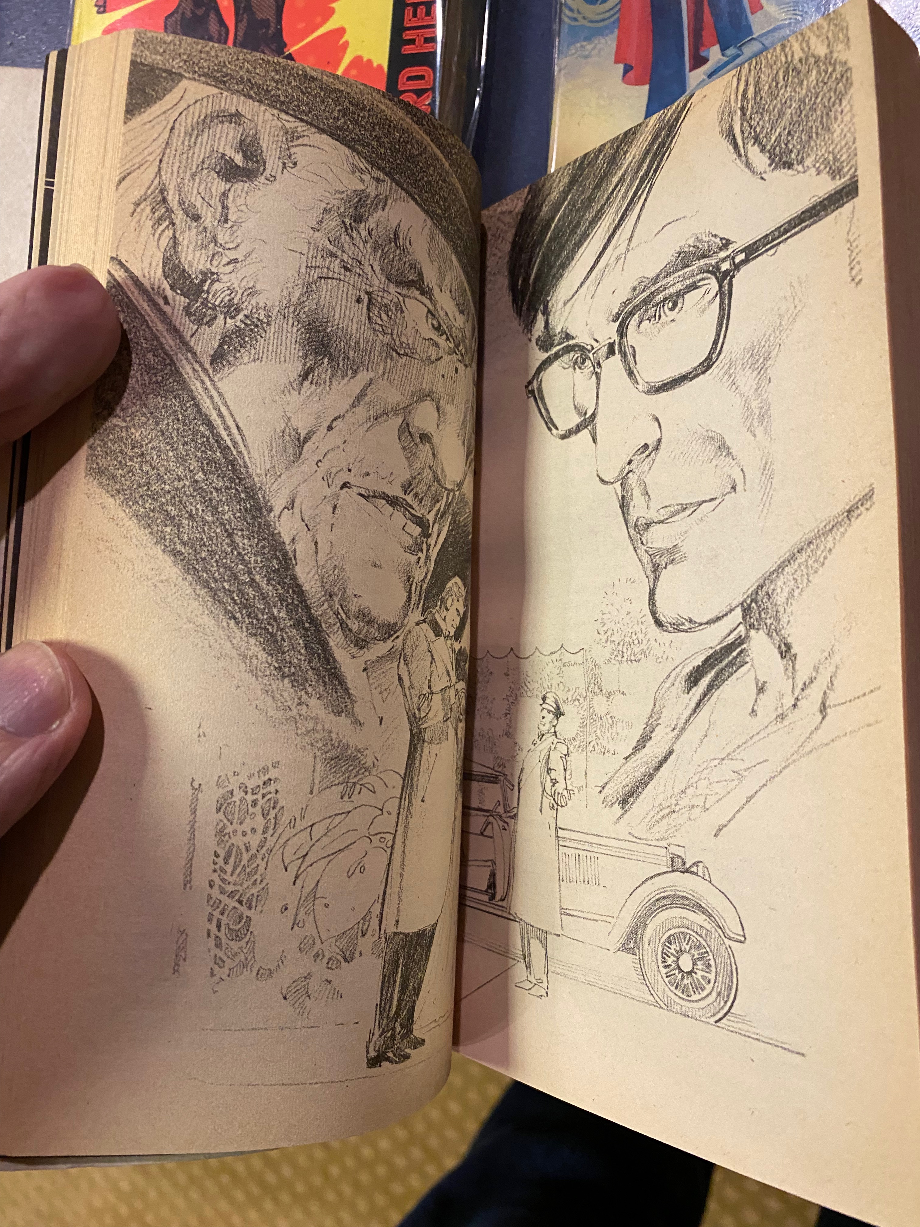
The pages below highlight Neal Adams’ artwork contribution the New York Review of Bird, a story featuring a thinly-disguised Harlan Ellison in his alter-ego of Cordwainer Bird, meeting an aged version of the Shadow.


The experiment lasted only 8 books, but they are worth tracking down to read something that really tried to stretch the envelope of graphic storytelling in the mid 1970s.

Sunday, January 14, 2024

The promise of Steranko's Comixscene in 1972

© Supergraphics and Steranko
Back in 1972, I had no concept of comics fandom, and was unaware of the British fanzines focused on American comics that were available through the classified ads of Exchange & Mart. I was even less aware of US fanzines, and really had no way of finding out about their existence as an adolescent schoolboy on Portsea Island.

So it’s quite an enjoyable experience to read comics news zines from that period for the first time, fifty or so years after publication. They encapsulate the hopes, dreams, excitement and aspirations we all had for the world of comics, where every tidbit of information about upcoming events was greeted with wonder.


This week I obtained a copy of issue #1 of Steranko’s “Comixscene” from November 1972, Jim Steranko's attempt to create a regular comics-focused newspaper that had high production values and had access to comics professsionals for news of upcoming events, as well as being a platform to promote Steranko’s own Supergraphics publications. I subsequently bought later issues a few years after, once I had visited Dark They Were & Golden Eyed in London, but back in 1972 Comixscene was an unknown quantity to me. 


Reading the issue now immediately takes me back to 1972.


The first issue focuses on Doc Savage and other pulp heroes soon to make an appearance in comics at both Marvel and DC. The highlights of this issue (for me) is the publication of Steranko's full-page rendition of The Shadow that he did as a pitch for DC, as well as a two page spread of Doc Savage and his crew as rendered by Steranko and fellow artists. I especially like the Gene Colon version, although the machine gun is out of place.


© Steranko. This would make a great poster

© Supergraphics and Steranko


© Supergraphics and Gene Colan

The cover of this first issue was subsequently used as the cover of the second issue of the Marvel colour comic. I prefer the version published on Comixscene.


© Marvel and Conde Nast.  Compare this with the Comixscene #1 cover

Did any of our regular readers collect Comixscene, or have recommendations for old fanzines to look out for?

Monday, April 24, 2023

Steranko in the Windy City


© Black Dog Books.

Back in the early carbon-copy days of SuperStuff (and I’m talking 1974 here), we could’ve only dreamed of sitting down and having a conversation with one of our idols. So this past Friday morning I started the day with no idea that by early afternoon I would’ve had a 30-minute conversation with famed  illustrator, comic historian, publisher and advertising/creative designer Jim Steranko, still vigorous, engaged and excited by the potential of the medium.

It happened this way. It had been a year since my last report of the annual Windy City Pulp and Paper Convention (see here for the 2022 report), so I decided to swing over to Yorktown Westin hotel in Lombard on Day One of the 2023 event to see what had changed in the year since the first post-COVID con had taken place. I was pleased to see that it was already vibrant and humming at 11am in the morning.

The Windy City Pulp & Paper con is a fascinating event, anchored around a main dealers room, with pulp-related films, auctions and panels taking place in smaller ball-rooms around the building. This is no scruffy comic mart set in the back-room of a downstate bowling alley. Attendance was high for a Friday morning, and a cursory look at prices indicated that the lower prices from last year, where many dealers were looking to shift pre-COVID inventory, were a thing of the past.


Upon arriving my welcome back contained a copy of Windy City Pulp Stories #22, an annual book published especially for the con by Black Dog books of Normal, Illinois.  In addition to reprinting some rare pulp stories ,it lead with a very interesting historical essay by Will Murray on the uncredited authors of G-8, plus also some fascinating excepts from the writers' trade journals of 1933, providing great insights in market conditions at that time. The idea of this book, providing content and context to stimulate further interest in the hobby seems a very sound one to me, and could be transferred to the comic-con world as well.


Being a pulp convention, the pickings for comics enthusiasts was generally limited to pulp-related comics, but also included many interesting novelties such as the colour Sunday Funnies sections from 1940s newspapers.


A box of Superman and Tarzan Sunday Funnies from the 1940s

My own route into the pulp world had been via the Doc Savage, Shadow and Avenger paperback reprints in the early 1970s, and then by the subsequent DC and Marvel comic adaptations of those characters. My knowledge of pulp history was subsequently informed by the research and writings of Will Murray and Ron Goulart. So I’m pretty much a pulp novice who doesn’t know too much about G-8 and His Battle Aces, or The Spider, or any of the more obscure characters that surfaced in the 1930s, parallel to the growth of the nascent Science Fiction pulp world. But if I had a barrel of cash this con would be the place to fill in the gaps in my knowledge - table after table of classic pulps - both adventure and SF - and 1950s/1960s paperbacks with their saucy, enticing covers by the artists who had made their bones in the pulp world. 


My first stop was at Chuck Welch’s table. Chuck is the editor of the pre-eminent Doc Savage fanzine “The Bronze Gazette”, which had carried a version of my blog entry on the links between Serpico and Doc Savage from a while back. It was a pleasure to meet him. I encourage anyone with an interest in Doc Savage to take a look at the website  . 


Following my first turn around the dealers table, I headed over to Will Murray’s table, shared with Anthony Tollin, to pick up a copy of Mr Murray’s expanded, revised and retitled edition of his 1980 work “The Duende History of the Shadow”, now christened “Dark Avenger - The Strange Saga of the Shadow”.  I can’t wait to find the time to read the book. Mr Murray also shared that he will be publishing a further volume, collecting a multitude of Shadow articles written over the years, which I will no doubt seek out.


© 2022. Will Murray

Finally I came to a table which was devoted to rare pulp items for sale. What had caught my eye was a copy of #1 of the UK Batman mini-pulps published under the World Adventure Library banner by World Distributors in 1967 - priced at $300! I had paid a pre-decimal one shilling for it in 1967, as recounted in this 2021 blog entry  .


Raising my eyes from the table, I encountered the outstretched hand of Jim Steranko himself on the opposite side, safari-suited and coiffed hair, introducing himself with the question “Can you think of any other comic book artist who has also held a fine art exhibition in one of the most prestigious galleries in the US?”.   I hazarded a guess that perhaps Frank Robbins had exhibited his paintings once he had retired to Mexico, but I don’t think that was the answer that Mr Steranko was looking for. 

Artwork © Steranko

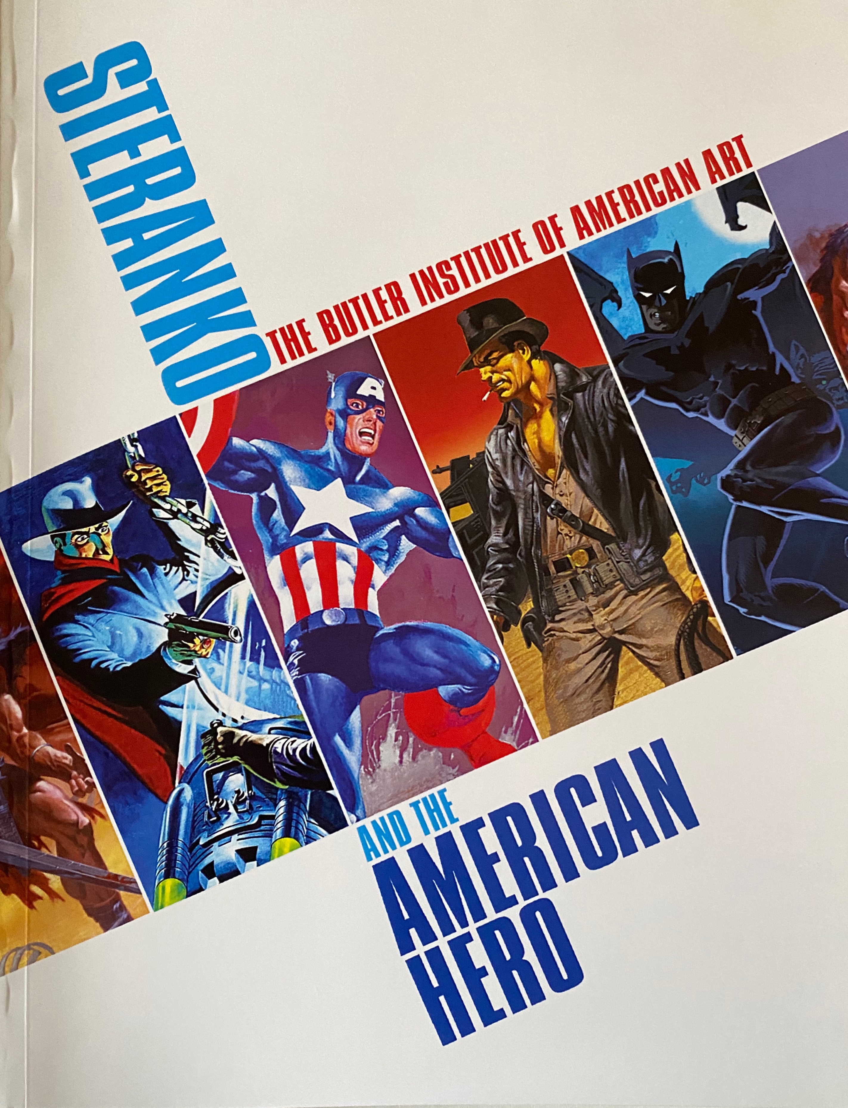
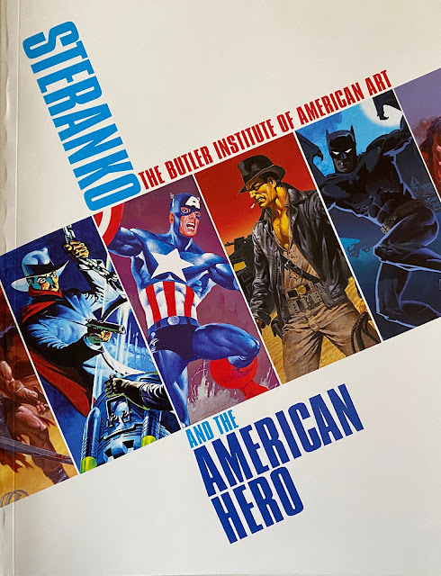
Referring to his artbook “Steranko and The American Hero”, published as a companion piece to his exhibition by the Butler Institute of American Art, we then had a pretty wide-ranging conversation about his approach to art. He opined that artists were either intuitive or analytical. He put Kirby in the intuitive category - someone who drew from his imagination without initial regard to composition - whereas Steranko saw himself on the analytical side, thinking through the placement of elements in a  picture, very much influenced by his advertising discipline.  One example of Kirby’s approach was a sketch of Captain America where Kirby started by drawing Cap’s belt buckle, and then expanding the image out from the centre.


We discussed Steranko’s work on Chandler, as well as his cover design for the Philip Marlowe graphic novel collection.


We also discussed his Shadow paperback covers commissioned for Jove/Pyramid back in the 1970s, and the degree of freedom that he had on overall design. There were no unpublished covers in that series - he always worked on commission. All fascinating stuff.


Mr Steranko  is still working today, most currently on conceptual art for Francis Ford Coppola’s upcoming film Megalopolis (currently in production), continuing a strand of conceptual artwork creation which encompassed Raiders of the Lost Ark, Blade Runner and Coppola’s Dracula.


My final question was about his famous work “Steranko’s History of Comics’, which was published as two volumes of an anticipated six-volume series. Steranko told me that in fact  he had envisioned a four-volume set. He said that he had completed much of the content for Volume 3, but whether it would ever be published was an open question.


I would have liked a photo of Mr Steranko, but he declined as it had been a policy of “no photos” that he’d had to adopt. I made do with his personalized signature in my copy of Steranko and The American Hero”. It was a great pleasure to meet the gentleman ; he is truly a force of nature and remains an outstanding talent. 


And now one of the last men standing from the Bronze Age.


Text © Ian Baker.


All images used are copyright their respective owners and are included here under the context of  Fair Use for the purposes of illustration


Saturday, October 30, 2021

Favourite spooky Comic Covers from the Bronze Age

 Inspired by a recent post over at McScotty’s blog (https://twthen.blogspot.com/2021/10/favourite-comics-best-mysteryhorror.html), and seeing that Halloween is fast approaching, I thought I’d put together a blog highlighting some of my most memorable spooky comic covers from the Bronze Age….not necessarily from comics dabbling in the supernatural, but simply those that sent a shiver down my spine to the extent that they come to mind almost fifty years later.

© DC Comics

First up is Shadow #2, “Freak Show Murders”. This comic cover was the first time I’d seen The Shadow, whom I'd had seen  previously mentioned in Fantasy Unlimited as a pulp hero template for Batman. This particular comic was in a batch that my Gran brought back to me in Southsea from the States following a family visit in September 1973. I had immediately phoned my pal Nigel to come round to our house, and I spread the comics that Gran had given my on the table-tennis table set up in our front room. The Shadow #2 caught my eye with its arresting green wash with the circus tent on a windy barren landscape with the solitary Shadow overseeing everything. It was my first exposure to the work of Mike Kaluta, and I was immediately a fan.


© DC Comics


Next is up is Phantom Stranger #17  which I bought from one of Mrs King’s newsagents in Albert Road, Southsea around the end of March 1972. Superb cover (I can remember a lot of PS covers) by Neal Adams stuck in my mind all these years. Perhaps the horror of running from a train? The color highlighting and shadows is what sells the image. The story “Like A Ghost from the Ashes” contains some of Jim Aparo’s best work. and the care than Aparo put into the interior artwork was exemplary. (Aparo’s work for DC in that period 1970-1972 was the peak of his powers IMHO). I particularly liked his use of fine dots for shadow in this scene below.


© DC comics


© DC Comics


My third spooky cover choice is Batman #237 "Night of the Reaper" which I got at the end of January 1972, featuring Batman and Robin involved in a story juxtaposing  the horror of the Nazi concentration camps with the jollity of Tom Fagan’s annual Halloween bash in Rutland, Vermont. The cover is so striking with its dominant red background. I loved the idea of Fagan’s annual Halloween parade, and collected many other comics that featured it over the years (The later 3-part Amazing Adventures/JLA/Thor crossover was a particular highlight). The Batman comic itself has superb Adams artwork and a suitably abrupt ending from the inventive pen of Denny O’Neil. Plus we get to see DC writers featured as supporting players. I loved that “breaking the fourth wall” thing.


Next up are a couple of choices from House of Mystery,  a comic which (along with House of Secrets) was a great favourite of mine in the early seventies. So many great Neal Adams covers in that 1969-1972 period, that I found it difficult to choose. Many featured young children in peril, interestingly. In the end I went for two covers, both because each served as the basis for subsequent covers featuring Batman.


© DC Comics


The first is House of Mystery #174, the first of that title after it moved to a horror format. I did not pick this up at the time, only as a back issue from Alan Austin’s Fantasy Unlimited a few years later, when I was disappointed to find that it was a reprint issue. However, I was struck by its similarity to Brave & Bold #93, which had triggered my interest in collecting the House of Mystery title in the first place. B&B #93 "Red Water, Crimson Death" has great interior artwork and features a picture of Neal Adams himself on a page highlighting DC accolades at the Comic Art convention.


Similarly House of Mystery #187 (July/August 1970) is a favorite because it was the template for my all-time favourite Batman cover Detective #405, (December 1970)  which featured the League of Assassins. The interior Detective comic artwork is typical Bob Brown, but the cover is outstanding. The inspiration presumably comes from the horror movie trope of the angry townspeople hunting down the monster/girl/hero.


© DC Comics


Next up is Brave & Bold #92, featuring the Bat Squad. I picked this up at a newsagents in Torrington (remember of the joy of finding excellent quality back issues on spinner racks in out of the way places?) on a family journey back from North Devon in 1971, and read in the darkness of the back seat of the car illuminated by the interior car light. A great cover and story drawn by Nick Cardy, written by Bob Haney. 


© DC comics


I loved the Batman of the Haneyverse, a guy who casually walked around town in his batsuit. This time he’s in that apocryphal hip London of the late sixties with fog and Carnaby Street and British police officers saying “By Jove”.  The Bat Squad (comprised of a group of hippies helping ol’ Bats) never made a return appearance (and the fact that DC couldn’t even be bothered to get Ira Schnapp to create a proper logo for them on the cover signaled uncertainty about the groups' longevity), but the cover stayed in my mind all these years. Great use of colour to make the image work, especially the yellow of the torchlight. Nick Cardy is an unsung hero in the pantheon of cover artists.


© Marvel Comics


Next up is Nick Fury, Agent of Shield #3, which I recently paid over the odds to get a decent copy recently, following a reminder in Kid’s blog over at https://kidr77.blogspot.com/ It is a classic cover of a woman in the shadow of a big house, running away, repurposed for the comic. I love it for featuring Batamn in the lower left, and the excellent Eisner inspired opening pages by Steranko. Some of his best work.


Incidentally House of Secrets seemed intent on producing similar covers with women running away from unseen horrors / see this run of covers from HoS.


© DC Comics. House of Secrets 88-90 on a "woman running from a castle" kick


I’ll close with two covers that appeared on paperbacks with comic connections.


© DC


The first is the cover of House of Mystery paperback tie-in HoM#1 written by Jack Oleck. The cover artwork by Wrightson has great colouring, and interior black & white spot illustrations convey his sensibility at its most ghoulish. I also had the follow up paperback, both bought in 1976 from Dark They Were & Golden-Eyed in London.


© Conde Nast


I’ll close with the cover of Doc Savage Bantam paperback #37, Hex. Not a comic cover, but up there with the best of James Bana’s painted covers. I bought it at a  book store in Passaic NJ in July 1977. The cover was so striking that I’m surprised that Grafitti Designs have not published a poster print as they have done of many other Doc Savage paperback covers.


So, thanks to McScotty and Kid for the inspiration for this post. Sorry there has been a bit of a gap since the last one. Happy Halloween!