Tuesday, January 3, 2023

Jack Kirby on Daredevil


by Ian Baker 

I have always liked Daredevil - most probably as he was “Red Batman”  ( a term coined by Mark Waid in his fun run of Daredevil back in 2013), and so as a Daredevil fan I bought my first ever Fantastic Four comic (back issue #73) this week for the princely sum of five bucks (four quid at current exchange rates)  because Daredevil was featured on the front cover.  What a bargain!  I was intrigued to see how Jack Kirby had rendered Daredevil on the inside pages of a comic. I’d been vaguely aware that he’d done layouts of Daredevil for John Romita in the early days, and had drawn a cover or two as well in the mid sixties. 

The received wisdom is that Daredevil had its origins as a standard Stan Lee-style Marvel superhero comic back in 1964. Jack Kirby provided character design assistance. After the first few issues, Wally Wood designed his stylized double-D chest insignia and streamlined his getup in devilish red, and Kirby had no further influence on the character.

So I thought I’d track the various Daredevil appearances as rendered by King Kirby, and try to determine what influence Jack had on the design and presentation of Ol' Hornhead in the relatively short period of his involvement with the character.

In fact, Kirby's influence can be seen in five distinct phases over the period 1964-1968.


Wave 1: April 1964-October 1964 - Design and early Covers


According to Tom Brevoort, the impetus for the creation of Daredevil came from Martin Goodman, who told Stan Lee that he’d made some investigations and that the trademark and copyright to the old Lev Gleason DAREDEVIL had been allowed to lapse. Goodman gave Stan instructions to create a Spider-Man knock-off to capitalize on the Web-Slinger's success. 


Lee turned to Jack Kirby to at least design the new character. Kirby’s design sheet was ultimately reworked into the bulk of the final cover image, albeit with many alterations made to it. And so Kirby's initial involvement with DD was limited to cover renditions of Daredevil in the first five issues, the interior artwork being done initially by Bill Everett, and then put in the hands of Joe Orlando and Vince Colletta, before being passed to the team of Wally Wood & Bob Powell.


Kirby's initial Daredevil design very much reflected a circus trapeze artist, bright and colourful in red and yellow. The billy-club holster was in the initial design.


©Marvel. Daredevil #1. April 1964 . Credit Kirby and Bill Everett
The cover to Daredevil #1 was very much a mash-up of various design elements, with Kirby's rendition of Daredevil seemingly pasted on to a crowd scene, inked by Bill Everett. The pose is classic Kirby, DD's arm outstretched to the reader. This image has subsequently remained the design touchstone for the character despite the costume changes over the subsequent years.


©Marvel. Daredevil #2. June 1964. Credit Kirby & Colletta

©Marvel. Daredevil #3. August 1964. Credit Kirby & Colletta
The covers for Daredevil #2 and #3 , credited to Kirby and Vince Colletta, have far less power. In #2 the rendition of Daredevil is awkward, and the drawing of Electro is very static ; I wonder if Kirby was really involved at all. Similarly, the drawing of DD running in from left-field on the cover of #3 bears none of Kirby's hallmarks ; no foreshortening of perspective, no threat from the villains, who seem very static.

©Marvel. Daredevil #4. October 1964. Credit Kirby & Colletta.
The cover of Daredevil #4 is a return to form of sorts, with DD in a classic design pose (perhaps lifted from initial design sketches) with a woman on his arm, which seems to have been added subsequently.  The Purple Man stands in the far background, again posing no real threat.


My overriding impression of these first four covers is of work that has been developed by committee, with very little design influence from Kirby other than the costume of the main character.


By issue #7, the creative reins had been handed over to Wally Wood, who redefined DD with new all-red costume, and a smaller, more lithe, less bulky build. 


Wave 2: May 1965-Sep 1965 - Crossover appearances, emulating Wally Wood


With Wally Wood now taking over DD with the April 1965 issue, there was to be a concerted push to get DD appearing in the pages of other Marvel comic books, to raise awareness of the hero and drive sales. The editorial decision was made to ensure that DD looked as much like the Wally Wood version as possible in all appearances to ensure consistency. Renditions of DD were to reflect the Wood design ethos, which were more about athleticism than muscular power.


We all know that Murphy Anderson redrew Superman’s face in Kirby’s run on Jimmy Olsen over at DC, but Wally Wood (and later Romita) redrew DD’s face on top of Kirby.


And so Kirby, inked by Colletta, next rendered Daredevil in Journey Into Mystery #116 - May 1965 . Daredevil only appears in 2 panels!! The first instance is of a tiny stick figure balancing on a wire, and the second panel looks very much like Wally Wood's version. This second panel does not seem to look like a Kirby pencil, or even Colletta inks. My bet is that Bob Powell both pencilled and inked DD in these panels.


©Marvel. DD in Journey Into Mystery #116

©Marvel. DD (rendered by Bob Powell?) in Journey Into Mystery #116

DD's next appearance was in Fantastic Four #39 - cover dated the following month, June 1965. This was the first part of a two-part story (continued in Fantastic Four #40) which finds our hero teamed with the Fantastic Four against Dr Doom. Kirby pencilled both issues, #39 inked by Frank Giacoia (as Frank Ray), and #40 inked by Vince Colletta.  It is pretty obvious that Wally Wood was brought in to re-draw or re--ink DD to ensure consistency, but in doing so the figure is often awkwardly rendered to fit into the existing Kirby artwork.


On the front cover of #39, DD is rendered differently to the Fantastic Four. Is he using his billy club as a walking stick? This cover looks to be a paste-up job. Looking at the action panels, I wonder if Kirby did more than the faintest pencil outlines for DD, as they have obviously been rendered by someone else.


The panel examples below from FF #39 and FF #40 give a good idea of the rendering of DD. In the panel from FF #39 the DD figure has none of the Kirby clothes-folds found in the FF costumes, or the famous Kirby renditions of cheekbones.

©Marvel. FF #39. DD has no trademark Kirby clothes creases or cheekbones

This page from Fantastic Four #40 shows DD in a Kirby pose in panel #1, although re-inked. The picture on the bottom left with DD firing his rifle is simply very awkward. The gloves have crease lines, but not the costume, indicating that Kirby perhaps drew the original figure. (And why the heck does DD need a SIGHT on the rifle???).

©Marvel FF #40. Why does DD need a rifle sight?

If we take a look at Daredevil rendered in his own comic Daredevil #8 , which was published between FF #39 and FF #40, we see that the DD is the FF comic is virtually identical to one both penciled and inked by Wally Wood.


©Marvel. Daredevil #8 penciled and inked by Wally Wood.

Daredevil's next crossover appearance was the following month, in the famous Fantastic Four Annual #3, published July 1965. This story - "Bedlam in the Baxter Building" - features the wedding of Reed Richards and Sue Storm, and features pretty much every Marvel character and Stan & Jack for good measure.


Daredevil appears on page 11, both as Matt Murdoch and DD, and the rendering of DD appears very much as Kirby pencils inked by Vince Colletta. The clothes creases are in evidence on DD's costume, as are Kirby poses. Matt Murdoch's cheekbones are in evidence, and Foggy Nelson look nothing like the Foggy Nelson as drawn by Wally Wood.


© Marvel. Fantastic Four Annual #3. Kirby & Colletta

© Marvel. Foggy Nelson by Wally Wood - nothing like Kirby's version

The final cross-over appearance by DD is a single panel of Matt Murdoch in a trial setting in X-Men #13  -  Sep 1965. This issue of X-Men was drawn by Werner Roth (billed as Jay Gavin) based on Kirby layouts. I can see no evidence of Wally Wood in the rendition of Matt Murdoch, so probably all the work of Werner Roth.


© Marvel. Werner Roth artwork on Kirby layout.

Wave 3: Jan 1966-Mar 1966 - Layouts 


The next involvement of Kirby with Daredevil were Daredevil issues #12 and #13, the first to be drawn by John Romita following the sudden departure of Wally Wood and Bob Powell from Marvel.


The story behind this was described by Miked Garland on "Jack Kirby Museum.org".


"Daredevil was, up until that time, in the creative hands of Wally Wood, who made the character more dynamic, visually stunning, and marketable than he ever was previously. Wood was, however, slated to begin work on the new “Sub- Mariner” series debuting in Astonish #70, which is probably why the character last appeared in Daredevil (#7). The Daredevil book was being handled by Wood associate Bob Powell, who was preserving the Wood “look.” In the interim, however, Wood had a huge disagreement with Lee and refused to do any more stories ......... By the cover date of Dec. ’65, Wood was gone, and Powell with him. Stan was initially going to bring in Dick Ayers to take over the book, but really didn’t want to take Dick away from his other drawing assignments; as Dick was preparing some pages for the Daredevil book (of which he still has a few), enter John Romita. Romita had just returned to Marvel, having known Stan from the “Timely” days; previous to his return he was grinding out romance work for DC. Stan immediately gave John the Daredevil assignment, but unlike Ayers, John was not used to working Marvel method, so… enter Jack Kirby. Jack laid-out issues #12-13, and by #14 Romita was well on his way, staying on the title until issue #19 when he leaves in order to take over the artistic seat in Spider-Man."


The two part story in Daredevil #12 and #13 introduced Ka-Zar into the DD universe. This was the first time that Kirby got to illustrate - or at least map out - a complete Daredevil story. Kirby's layouts could range from fully-penciled panels to simply descriptive text. Certainly Kirby's layouts always followed the dominant 4, 5 or 6 panel page designs that he employed in the 1960s.


Page 4 from issue #12 (below) shows a strong Kirby design influence and layout in Romita's artwork. Some of this multiple action-oriented panel design would be adopted by Gene Colan when he took subsequently over the strip from Romita.

© Marvel. Daredevil #12. Romita art on Kirby layouts

With the second part of the story in Daredevil #13, the front cover was given over to a Kirby-drawn Daredevil overlaid on a Romita background. This Kirby-drawn Daredevil was to become an iconic rendition of the character.


© Marvel. Daredevil #13.  Kirby DD overlaid on Romita background.

Kirby's panel design influence continues to be seen in the interior of Daredevil #13, although the panel content is more recognizable as later Romita. One example of Kirby design influence is the "looking through the legs" shot, which he used many times through his drawing career.


© Marvel. Daredevil #13 original artwork by Romita on Kirby layout.

© Marvel. Typical Kirby "legs apart" stance from Fanastic Four #14

Although Kirby is only credited on layouts for DD #12 and #13, the first issue that Romita received sole artistic credits still shows Kirby layout influence on page 2 in a standard 6-panel page, before Romita adopting different sized panels and combinations in the remainder of the comic.


Following the layouts in Daredevil #12-#13  (and perhaps #14), there then began a two-year gap where there was no overt Kirby influence on Daredevil


Wave 4: April 1968 - Emulating Gene Colan


John Romita’s last issue of Daredevil was #19  (Aug 1966 issue) with Gene Conan taking over with #20 (Oct 1966). It must be said that by issue #19 Romita had made his mark on the comic, and Gene Colan's picking up of the reins had a strong sense of continuity while injecting a strong dose of adrenaline into the artwork, expanding into a far more innovative use of panel design.


Once Gene Colan had introduced energy and dynamism, Kirby’s rendition was more in keeping with the current version. And so Kirby's next (and final) take on the character on interior pages in Fantastic Four #73 (April 1968) had much in common with the Colon version while retaining the Kirby style.  This FF issue was a continuation of the story from Daredevil #38, and so some attention was presumably paid to some level of artistic continuity. The artwork in FF #73 was Kirby inked by Joe Sinnott.  There seems to be no intent to modify the figure, although I suspect that DD's face may have been retouched in places by John Romita (who was Stan Lee's go-to guy for re-touching in those years).


In this example of original artwork from page 14 of Fantastic Four #73 DD's face in the middle panel has been clearly "fixed" subsequent to Sinnott's inks:


© Marvel. FF #73. Note white-out correction on DD's face in middle panel (as well as fix on billy-club holster)

Page 2 shows DD's face in a typically Kirby rendition, whereas DD facial close-up on page 4 is clearly the work of another artist.
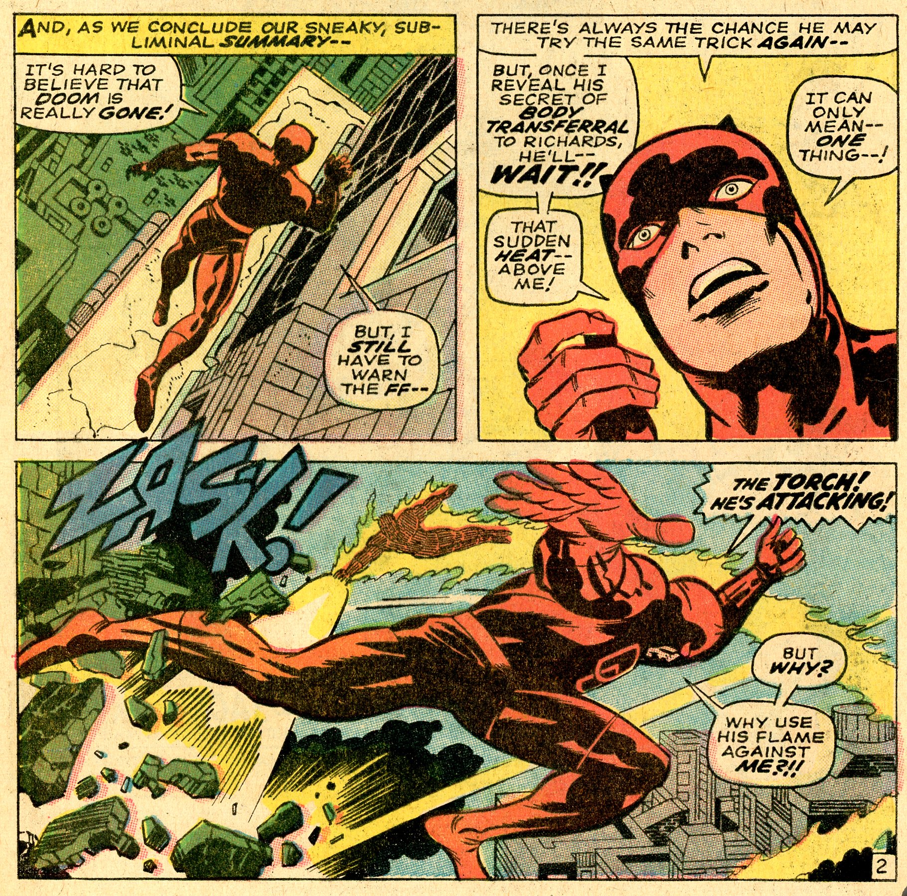

© Marvel FF #73 page 2 - Daredevil unretouched

© Marvel. FF #73 page 4. Daredevil and Spider-Man heads redrawn in 2nd panel

And that was pretty much Kirby's final brush with Daredevil, save for one final cover:


Wave 5:   August 1968 - Kirby Un-retouched - maybe.


Kirby's final rendition of Daredevil was the cover of Daredevil #43 - August 1968 , in which he fights Captain America. Interior artwork was by Gene Colan. This is a classic Kirby cover, foreshortened perspective and full of power.


The cover was penciled by Kirby, inked by Joe Sinnott. Comparing the published cover to the original artwork, there appears to have been no corrections made to the original art by other hands. So at least Kirby's final rendition of Daredevil was as close to his vision as possible, given that Sinnott was Kirby's favourite inker.


© Marvel. Daredevil #43

© Marvel. Original Artwork for Daredevil #43. No visible Daredevil corrections


In conclusion, I believe that the relative lack of Kirby work on Daredevil was an opportunity missed, given that he co-created the original costume, and that he produced a very small quantity of un-retouched dynamic imagery. It would have been a treat to see at least one solo Kirby issue of Daredevil, but it was not to be.

Friday, December 30, 2022

Searching for comics in Portsmouth, 1970s style - Part Five

 By Ian Baker and Nigel Brown


© Google Maps. The final sections of the route

Do you remember when collecting comics was all about the content, not the condition of the book? Just getting a new story was satisfaction enough, and second-hand shops were the place in the early seventies to find those gems from the days of early Marvels and Silver Age DCs. I was reminded of that experience earlier this week when I visited my local Half-Price books and saw decent copies of  FF #73, FF #87 and FF #32 for sale at a combined total of $14!   You
can go home again!


The last four stops on this epic 5-part series recalling cycle-rides around Portsmouth in the early 1970s are all second-hand shops that figured large in our travels. They were further north on Portsea Island from Southsea, but that was nothing to teenage lads with Carlton Corsa racing bikes and school haversacks ready to carry the goods.


We take up our journey traveling north from Arundel Street (see previous episode) towards Buckland......


Stop #25 - Second-hand Shop just inside Church Rd, off St.John’s Road


Even St.John’s Road in that part of Portsmouth hasn’t survived the residential redevelopment since the 1970s. I think it was somewhere around where Glidden Close is today, just south of St.John’s Cathedral Catholic Primary School.


© Google. Area highlighted is where shop was located.

 
© DC. The actual GL/GA #76


©DC. Forever People #1


“It was a dreadful dump, mentioned in that article ‘Memories Are Made Of This’ by Dave Jackson in Comics Unlimited # 33. Demolished since then. That whole area’s been redeveloped a long time now, but in those days there were rows of terraced houses, and a small parade of shops. That was where I got a Forever People # 1, and a GL/GA #76 for 1p each. A few years later I showed the GL/GA to my friend Neil when he came round one day to see my comic collection. I offered it to him for £5. He really wanted it, but his mum wouldn’t pay out!” – Nigel 


Stop #26 - Second-hand Shop at the end of Lake Road, part of a small row, close to the corner opposite Constad Jewellers, near to St.Mary’s Church in Fratton


The route of Lake Road was re-aligned in the late 1970s, but in our comic collecting days it joined Kingston Road at the Tramway Arms. The second-hand shop was on the south side of the road, across Kingston Rd from Hampshire Street.


©DC. Flash #113 - a opportunity passed up

“I remember they had junk furniture sticking out into the street. The place never looked very promising but once – significantly – they had a small collection of very early 1960s Flash comics for sale that I hadn’t seen elsewhere (and not again until at the London comic marts). Issues like Flash # 113.” – Nigel 


Stop #27 - Gibbs – New Road, Fratton/Copnor boundary, between Burleigh Road and Langford Road


©Google. Row of shops where Gibbs used to be

“Another second-hand shop Geoff introduced us to. My memory is that it was run by a Mrs. Gibbs (“Ma Gibbs” as she was known locally in Copnor) who had books and magazines and comics in piles around the shop, frequently with one or more of her many cats sitting on the papers. The place smelled of cat, or cat food. 

The shop had a yellow front with one of those dog mannequins outside with a slot for donations for animal welfare. It has been said that once her bills were paid, Mrs Gibbs gave all the remainder to the RSPCA.

It did turn out to be a good place to get old Bantam Doc Savage paperbacks. I picked up copies of both Doc Savage paperbacks #14 and #22 there in April 1976.” – Ian


“This was an old favourite, and often reliable, run by an older lady, a slightly less caustic version of Ena Sharples, I always thought. The shop had a striking yellow frontage.” – Nigel 


Stop #28 - Second-hand Shop on corner of Knox Rd and Stamshaw Road, close to Angerstein Road


©Google. Location of 2nd hand shop corner of Knox Rd and Stamshaw Rd. Another residential conversion


©DC. Ian picked up a very scruffy version of Batman #213 - I think it was coverless.

©Marvel. Another gem picked up at Knox Rd - Ian's earliest Conan (at that time).


“We have Geoff (Cousins) to thank for identifying this shop. They had a pile of very early 60s comics, rough condition. Plus Doc Savage paperbacks. I remember getting an early Conan here (Conan #5). Also a very tatty copy of Batman Giant #213. My overriding memory  is that the place had a stale odour.” – Ian

“This shop was a bit of a cycle ride, up in North End. Perhaps it was the first time I went there, but I remember there were a particularly nice pile of American comics for sale. After that, I always anticipated a good haul of comics and most visits didn’t disappoint. The comics pile was along the side of the shop, close to the window. I recall the owner was a little dumpy lady, with short black hair.

“Once I passed on a Teen Titans comic because there was no number on the cover. It was Teen Titans #1.”  – Nigel


“I remember going to a shop on the corner of Knox Rd & Stamshaw Rd, buying D C & Marvel comics, return when read take back & swop with a penny to get another. Being a geek. Great .” Wayne Johnson from FB “Memories of Bygone Portsmouth”


Our knowledge of the North-East area of Portsmouth was mostly due to the familiarity our pal Geoff Cousins had of the area, having grown up in Copnor. And so our final stop - Stop #29 , if Geoff was accompanying us on our travels, was a corner newsagent in Tangier Rd, close to Geoff's Nan's house where a glass of orange squash might be waiting.


*****************************************


Nigel Brown writes:


About ten years after those halcyon days, my research for our fanzine SuperStuff No.11 (Aug.1984) took me back around the streets of Portsmouth and Southsea. I reported:


            ‘Of the second-hand shops we haunted, on a recent trip I was only able to find two that possibly had some comics for sale. In one, a shop, in Angerstein Road where they always had sixty to seventy comics in a pile in the corner, I was told, “I can’t get them for love nor money.” In the other, Gibb’s in New Road, I was shown a mangy pile of Charltons and a few badly damaged Marvels (last months, I think!). Oh yes, and a copy of Detective Comics No.426 (1972) that wasn’t even in good enough condition to buy at 6 pence. These were the only two second-hand shops, of the ones we used to visit that I could find at all! Some, like the old Book Exchange have been knocked down to make way for a rubbish tip, and some, like a smelly old place in Arundel street that was always good for 1960 to 1964 DCs have been boarded up and lie derelict.’

            By now, in 2022, charity shops have replaced those private enterprises in the ecosystem of the high street. In some cases, a second-hand shop’s position in a residential area has encouraged a re-conversion back into a residential dwelling (eg. The Book Exchange in Devonshire Avenue). 

            I think, too, that the move of American comics from the easily available newsstands into specialist direct-sale shops has cut off the supply of old comics to charity/second-hand shops. That, together with the now-common perception amongst the public that old comics are ‘worth money’, leading to preferred sales through eBay, or to comic dealers, means that even the charity shops are unlikely to stock old comics.


********************************************


Well, that about wraps up our memories of newsagents and second-hand shops in Portsmouth in the early to mid 1970s.  Interestingly, in all of our travels on the Comic Hunt I do not recall ever crossing paths with other collectors, which in retrospect seems strange on an island city of a quarter of a million people. Certainly there was enough comic content available to satisfy the demands of scores of teenage schoolboys. The letters pages of fanzine Fantasy Unlimited (later Comics Unlimited) revealed the names Dave Jackson and Bernard Smith as avid Portsmouth-based fans in those mid-70s days, who frequented the very same haunts, but we have yet to meet them. Hopefully some of them will see this blog entry and raise their heads above the parapet in the comments section below.


Of course, collecting comics in Portsmouth didn’t end then! Look out for the next in this series:


‘Beyond the Bronze Age (early 1980s to the present day)’


Thursday, December 22, 2022

Happy Festive Period!


©DC and Marvel. Artwork by Michael Cho

Thanks to everyone who dropped by and commented this past year from the SuperStuff blog team! 

With a good following wind we should be able to close out the year with one more post, the final stage of reminisces of cycling around Portsmouth comic shops in the 1970s, so watch out for that one.

A single Christmas quiz re the image at the top of this blog post (drawn by Michael Cho)....what is incorrect about it? Answers in the comments section please.

And now.....off to start shoveling the snow....


Wednesday, December 14, 2022

The Book That Never Was - DC Universe Illustrated by Neal Adams - Vol 2

 by Ian Baker

©DC. Advance image of cover for Volume Two.

Back on January 13th, 2009, DC published what was to be the first of a series of three trade hardbacks (and paperbacks) of collected comic stories drawn by Neal Adams, bringing together his DC work beyond the realm of Batman, Green Lantern/Green Arrow and Deadman, which had already been reprinted as collections on multiple occasions 

The previous hardcover collections of Adams' work on Batman had been very successful, and so the decision was taken to curate three more volumes that would bring to light Adams' lesser known work on War, Horror, Western and Humour comics at National, dating from Adams first work for the company in 1967. Adams would re-colour the selected stories, as he had done (somewhat controversially) on the Batman volumes since their first publication in October 2003.

The first volume of DC Universe Illustrated by Neal Adams contained a mixture of war stories from Our Army At War and Star-Spangled War Stories, along with a few Super-Hero tales in the form of Teen Titans, Superman and Elongated Man. [Note: the list of stories on MikesAmazingWorld.com is incorrect]. The package was topped off with some sketches and public service ads to pad out the Superhero material in the book. No covers were reproduced, though, which I found to be a disappointment. The new cover drawn by Adams in 2009 focused solely on the Superhero content of the book, and is not one of my favourites. It went through at least one rejected iteration before the final cover of the first printing was agreed.The imagery is somewhat humourous, at odds with the war story content within. A subsequent printing of the book replaced the cover with an image of the Justice League, harvested from a Dollar comic - DC Summer Special 1977.

©DC. Unused Cover for Volume One. From Albert Moy website

©DC Final cover for Volume One


©DC. Second Print Cover of Volume One. Taken from DC Summer Special 1977
In discussion with Neal Adams at the New York Comic Con nine months later in October 2009 (see Superstuff blog Meeting Neal Adams), he mentioned to me that work was underway on the project to "collect together all the old crap" including early covers. He expressed dissatisfaction with the technical proficiency of some of his early work (although it all looks brilliant to me), and in his introduction to volume one he mentions "the quirky and terrible job" he did on the Elongated Man story in Detective #369. These books were an opportunity to rectify past illustrative mistakes (in his eyes), plus re-ink stories if needed.

The first volume of DC Universe Illustrated by Neal Adams sold respectably, but it was decided to put Volume Two on hold for a while. The second volume would focus on Adams' work on Supernatural hero material ; the proposed cover as shown in solicitations (see top of blog) highlights the Spectre, Phantom Stranger and El Diablo (a supernatural anti-hero with a Western slant). Work got underway, and an announcement was made in the trade press that the hardcover version of Volume Two would contain 192 pages, to be published on November 6th, 2012. An ISBN number was secured for the publication - 9781401225186 (ISBN10: 1401225187).

Somewhere along the line, the decision was made not to publish the book after all; perhaps sales projections were low, or perhaps Adams had not progressed sufficiently on re-colouring the stories. Which is a shame, as the proposed stories contained some of his very best work.

The proposed contents and running order of the book have not been made public, but a bit of analysis and educated guesswork leads me to suggest the following items. Certainly the proposed cover confirms stories about The Spectre, Phantom Stranger and El Diablo (from Weird Western Tales), composed of a collage of interior images from Spectre #5, Phantom Stranger #4 and Weird Western Tales #13.

Here is my suggested contents list:
  • Assume 9 pages for introductions and forewords, mirroring the layout of Volume One - (Volume One story reprints start on page 10 (so 9 before)
  • Spectre #2 - "DIE SPECTRE--AGAIN!" (Story: Gardner Fox) 23pgs plus cover
  • Spectre #3 - "Hang 'Em Up Wildcat - You're Finished!"  (Story & Art: Neal Adams) 24 pgs plus cover
  • Spectre #4 - "Stop That Kid..Before He Wrecks The World!" (Story & Art: Neal Adams) 23 page plus cover
  • Spectre #5 - "The Spectre Means Death?" (Story & Art: Neal Adams) 22 pages plus cover
  • Phantom Stranger #4 - "The Dead Don't Sleep Forever" (Writer: Bob Kanigher, Pencils: Neal Adams, Inks: Bill Draut)  23 pages plus cover
  • Weird Western Tales #12 - "A Time To Die" (Writer: Cary Bates, Pencils: Neal Adams, Inks: Berni Wrightson) 4 pages 
  • Weird Western Tales #13 - "Night of the Living Dead" (Writer: Cary Bates, Art: Neal Adams) 11 pages
  • Weird Western Tales #15 - "Never Kill A Demon" (Writer: Cary Bates, Art: Neal Adams) 12 pages plus cover  
  • Biographies of writers and inkers (3 pages)

The material above would cover 160 pages (or 154 pages if Adams' covers were not included). That leaves 38 pages to fill in Volume Two. 

If we assume that the theme of the future bumper final Volume Three would be "Humour and Horror", to include the Bob Hope & Jerry Lewis comics (186 pages) plus 90 pages worth from the titles House of Mystery, House of Secrets, Witching Hour, Secrets of Sinister House, that leaves these oddities for inclusion in Volume Two:
  • Superman #249 'The Origin of Terra-Man'  7 pages
  • Weird War Tales #8 'Thou Shalt Not Kill' 7 pages  (Adams inks on Crusty Bunkers' penciler Steve Harper) - unlikely inclusion - 
  • Action Comics #425 'Human Target:The Short-Walk-to-Disaster Contract' 6 pages
  • Hot Wheels #6 'The Humbug Run' - 14 pages
These add up to 34 additional pages (excluding Adams' cover to Weird War Tales #8). Alternatively, these four stories could be held over for Volume Three and replaced with the covers that Adams did for The Spectre and Phantom Stranger, all of which were absolute crackers.

The Spectre issues


The Spectre stories as drawn (and mostly written) by Adams are uniformly excellent. [ For an in-depth commentary on those issues, I refer you to Part One of Nigel Brown's article "The Spectre 1966-1975" as published long ago in SuperStuff #6 (Mar 21st 1976).]

©DC. Spectre #2 cover (courtesy of HotComics.net).

Issue #2 (above) contains a story by Gardner Fox with art by Adams. Great artwork, but uninteresting story. Adams really hit his stride with #3 (below), writing and drawing, bringing back Wildcat as the main protagonist, and really pushing the envelope of inventiveness on the artwork, incorporating collages, perhaps inspired by Jack Kirby.

©DC Spectre #3.

©DC. Interesting use of collage by Adams

Issue Spectre #4 hits the high point of the run with "Stop That Kid...Before He Wrecks The World!", again story and art by Adams.

©DC. Spectre #4

©DC. Sample page from Spectre #4. Such detail and care and dynamism.

With issue #5, Adams' last Spectre book, he intrigues us with a prologue that has later echoes of Batman's time in snow-clad Nanda Parbat, as well as treats us to what may have been Adams first double-page spread in a DC comic!

©DC. Spectre #5 - the template for the aborted TPB Volume Two

©DC Spectre #5 - the intriguing prologue

©DC. Double page-spread in an off-kilter angle city street style that Adams would return to a number of times in subsequent comics

Phantom Stranger

©DC. Phantom Stranger #4

©DC. Love the detail of the city skyline plus the up-angle and sky colouring of the bottom panel.
The Phantom Stranger #4 story is the sole time that Adams tackled the character in an interior story (despite drawing the covers for every issue from #3 to #19) , in a story featuring both the Stranger and Dr Thirteen.  I loved it.  The Stranger is much more of a protagonist than an observer. Adams set the artistic bar for the book so high following the workmanlike work of Bill Draut, that it was only when Jim Aparo took the artistic reins on the interiors with issue #7 that the book regained its stride.

El Diablo - Weird Western Tales


The three El Diablo stories contain some of Adams best work of the 70s...the detail is amazing and rivals the best of Green Lantern/Green Arrow and Batman in this period. Was this only time that Adams and Berni Wrightson collaborated?

©DC, Weird Western Tales #12. Adams & Wrightson

©DC. Weird Western Tales #13. Pencils, Inking and Colours by Adams.

©DC. Weird Western Tales #15. The only El Diablo cover by Adams.


If by some chance Volume Two was published, or someone had an advance copy, I'd love to know the final content.
