Friday, June 2, 2023

Non-Distributed Wonders: Marvel’s Supernatural Thrillers

©Marvel. Cover by Steranko.


Over the past few months I’ve been taking notice of the failed experiments that Marvel and DC conducted in the early seventies; books that exploded onto the newsstand, flared and then failed.  The current DC Black Label comic Danger Street, written by Tom King, is an interesting example of picking up discarded DC Bronze Age First Issue Special characters and weaving them into something fresh and new. And I’ve developed something of a fascination for tracking down short-lived Bronze Age books that passed me by back in the swinging seventies.


A couple of months back I wrote a blog entry detailing the development and demise of Marvel title Worlds Unknown a series of eight colour comic books which preceded the Marvel Black & White magazine Unknown Worlds of Science Fiction, set up by Roy Thomas to adapt classic Science Fiction novels in comic format.


These colour books escaped our attention in the UK as they were “Non-distributed” - not selected for distribution to UK newsagents by World Distributors. “ND” books quickly acquired a cachet all their own; their unattainable nature by normal means gave them a halo of exceptionalism, whatever the actual quality might be. Brief snippets of information as mentioned in Comic Media News or “Fox on the Run” or “The Worlds of Emlock” within the pages of Comics Unlimited only served to whet the appetite to an even greater degree.


Of course, ND comics cost 25p from comic dealers, whereas new comics on the stands were still only 9p each. But somehow I just accepted the extortionate pricing on the basis of the axiom that “the quality remained long after the price was forgotten”.


Worlds Unknown was not the only anthology book exploiting classic literature to endure the fate of “Non-distribution”. Equally interesting was the four-colour comic Supernatural Thrillers which we’ll take a closer look at today.


Like Worlds Unknown, comic Supernatural Thrillers similarly was to morph into a Curtis-distributed  Marvel Black & White magazine - in this case Masters of Terror, a magazine that was to run for two issues in the Summer of 1975, and be briefly revived as as issue of Marvel Preview in the Autumn of 1978.


I turned sixteen in the summer of 1975, was getting into Horror and SF novels, and would have been the ideal target audience for this book, had it been distributed in the UK. So now  forty-plus years later I’ve spent the last few months tracking down actual copies of these books for my own collection (no resorting to digital copies here!).


The concept behind Supernatural Thrillers was to render classic Science Fiction and/or Horror stories into comics format, with the intent of appealing to a wider audience. Unlike Unknown Worlds, the initiative was from Stan the Man himself, who then handed it over to Roy Thomas to run with. Roy later recounted in Alter Ego #70 :


JA: You did that Worlds Unknown color comic— 

THOMAS: Yeah, that was a favorite. But it didn’t sell.

JA: —and I forget the name of the other one, that had that great Steranko cover with The Invisible Man.

THOMAS: That was Supernatural Thrillers. Stan had the idea for that one, then turned it over to me, and I decided we should adapt some fantasy/horror classics, like Theodore Sturgeon’s “It” and “Killdozer.” H.G. Wells’ The Invisible Man was Stan’s idea. I remember some of those worked out quite well, like Howard’s “Valley of the Worm.”


Despite the revisions in the Comics Code in 1971 which lifted the restrictions on Horror comics, the words “Horror” and “Terror” could not be used on a 4-color comic cover. 


General Standards – Part B

      • No comics magazine shall use the word horror or terror in its title. The words may be used judiciously in the body of the magazine. [Footnote: The word horror or terror in a story title in the body of the magazine has been ruled to be an injudicious use, and therefore is not permitted.]


As shown at the top of this blog entry, the first issue cover dated Dec 1972 arrived with all stops pulled out. It sported a colourful cover by Steranko showing a muck-encrusted Swamp Monster being shot by what appears to be a big game hunter, with a tabloid style banner and sales pitch in overdrive.


The cover promised an exciting pursuit story, but in fact featured a very thoughtful and melancholy adaptation of Theodore Sturgeon’s novella “IT!”, as written by Roy Thomas himself and drawn sensitively by Marie Severin, inked by Frank Giacoia..  


© Marvel. Cover by Steranko

Before the sales figures were in, issue #2 hit the stands, which featured an adaptation of H. G. Wells’ “The Invisible Man” by Ron Goulart, with Val Mayerik and Dan Adkins on artistic duties. The cover was again drawn by Steranko. Reading this book now for the first time, my familiarity with Wells’ story took away any real impact of what is a well-drawn and coherent adaptation, giving some allowance for the “Gor Blimey, Guv” British stereotypes present in the book.


©Marvel. Cover by Gil Kane.

Issue #3 was the first signal of a change in direction, from adapting “classic” novels to adapting pulps - an adaptation of Robert E. Howard’s “The Valley of the Worm” scripted by Roy Thomas, and drawn by Gil Kane and Ernie Chan. Thomas commented in Alter Ego #70:


THOMAS:  I always thought in terms of bringing pulp-like writing into comics—even Doc Savage, which I was never wild about as writing—and there were a lot of clumsy things about Burroughs, even Howard. It was all pulp-type writing, but I felt that bringing in those characters and those concepts would elevate comics a little. It wasn’t that I didn’t like what Stan Lee, Gardner Fox, and other people had done, myself included... or that everything Howard did was better than most of what, say, Stan Lee did. It’s just that I felt that having a non- comics approach would broaden the appeal of comics and enrich it in some vague way. This is the same motivation that later made me want to bring in science-fiction and to do horror adaptations and not just new stories.


The adaptation was a detailed and thorough Sword & Sorcery adaptation of the REH story. Great artwork and an engrossing story.


"The Valley of the Worm" was to be very warmly received by readers, getting more positive mail than the first two issues combined.


The story was later reprinted in issue #1 of B&W Kull and the Barbarians in the May 1975 issue, a new comic that Roy kicked off, which ran for 3 issues. Issue #1 was a book of reprint material of various Robert E Howard stories previously printed in various colour comics [Read Roy’s comments from zip comic ]


The letter col in issue #3 was full of praise for issue #1, with a letter from future comics pro David Michelinie himself.   The editorial commentary from Roy intimated that Marvel had put itself in a bit of a strait-jacket with mandating a supernatural element in each story, as the line between SF and Supernatural was thin. Marvel would shortly be premiering a sister mag called Worlds Unknown for purely SF, so it started to signal that Supernatural Thrillers was still finding it’s feet since the first three issues had adapted first a modern SF novella, then a classic horror story, and then a Sword & Sorcery pulp.


All three issues were strong individually, but there was no consistency of identity across the books, which is especially important in an anthology title. Supernatural Thrillers did not even have an identifiable logo, so each issue appeared to be a one-off.


©Marvel. Cover by John Romita Sr.


Supernatural Thrillers #4 returned to classic out-of-copyright source material with an adaptation of R.L. Stevenson’s “Dr Jekyll and Mr Hyde”. The rendering of Mr Hyde on the cover could have been easily re-coloured to be The Hulk, which of course, may have been John Romita's nod to the original source idea for the Hulk.


© Marvel

But with issue #5, the format departed from existing classic material, becoming an adventure comic - featuring a brand-new story of The Living Mummy, written by Steve Gerber, drawn by Rich Buckler and Frank Chiarmonte.  There seems to be deliberate echoes emulating Neal Adams in places - see page 11, and page 12 for example  - and the villain is drawn in an eerily similar mannger to those Adams drew in the Batman/House of Mystery team-up from Brave and Bold #93 “Red Water, Crimson Death”.


Issue #11. Rich Buckler channeling Neal Adams?

The villain in The Living Mummy. © Marvel

©DC. The villain from B&B #93, by Neal Adams
The editorial comment in the lettercol in issue #5 makes no mention of the abrupt change of pace with the introduction of the new  The Living Mummy. But it does include a plug for the new Marvel B&Ws - Dracula Lives!, Tales of the Zombie!, Vampire Tales!, Monsters Unleashed! and the new prose Horror book The Haunt of Horror (no exclamation make after this title).. 


Issue #6 then returns to an established literary property The Legend of Sleepy Hollow as the basis for a brand-new feature “The Headless Horseman Rides Again”, written by Gary Friedrich and drawn by George Tuska.   There was no lettercol in this issue, and I found the artwork uninspired, but I was never a particular George Tuska fan.


With issue #7 - with a very nice art job by Val Mayerik - the decision had been made to stick with The Living Mummy, and jettison the idea of a supernatural anthology four-colour comic.    Stan Lee had come to the conclusion that the B&W magazine format offered more scope outside the confines of the Comics Code Authority, as well as enabled to cater to a more adult audience.


With issue #10  Roy Thomas handed the editorial reins to Len Wein. The comic continued as “The Living Mummy” until its demise with the Oct 1975 issue. However, three months earlier, in July 1975, in parallel with the new Kull and the Barbarians B&W magazine mentioned above,  Marvel decided to issue a new B&W Masters of Terror B&W magazine harvesting early material from Supernatural Thrillers.


As the Marvel Black & White magazine reprints were not under the aegis of the CCA, the word “Terror” could be used in the title without fear of repercussions. 


© Marvel

© Marvel
The covers for issues #1 and #2 adapted the original Supernatural Thrillers covers, but were painted versions of the original Steranko artwork, this time by Gray Morrow and Dad Adkins respectively. These are very nice issues, and I think presenting the material in the B&W format brought a more adult sensibility to the content.


The final “Masters of Terror” was a one-off issue of Marvel Preview. The new book shared nothing with its predecessor other than the title, and was an attempt to bring a hybrid Private Detective/Horror title to the market, as explained by editor Rick Marschall. 


I really like this magazine, not least for the superb Gene Colan artwork across three separate stories, plus it has a very interesting article by Ron Goulart on "The Rise of the Private Eye" in popular fiction. I would have sought out more if it had been a success, but obviously it did not elicit sufficient reader interest.

© Marvel. Gene Colan's artwork in Marvel Preview #16


In conclusion, Supernatural Thrillers was an experiment that failed. largely due to having insufficient clarity on what it wanted to be. By all accounts, Roy Thomas was far more interested in a hard-SF book, as shown in Unknown Worlds. But these books are not without merit, and worth picking up to experience Marvel trying to push the boundaries of the comic book in the early 1970s.


The Living Mummy is one of the lesser/known Marvel characters, appearing only once more in a team-up with The Thing in Marvel Two-In-One #95 in 1983.


Perhaps the character will re-appear in the Marvel Cinematic Universe at some point. It would be an ideal candidate for a Marvel TV one-off, similar to last Halloween’s "Werewolf by Night" film.


Did any of our regular readers collect Supernatural Thrillers? Thoughts?


Tuesday, May 2, 2023

Batman ’66 Trading Cards oddities #4 :Who was the mystery artist?

Batman "Black Bat" Card #14 - Nightly Patrol

The received wisdom of the artist behind the three sets of painted Batman trading cards issued by Topps in the US (and A&BC in the UK) in 1966 was pulp artist Norman Saunders, working to outlines sketched by famed comic artist Bob Powell. 


I’ve touched on this subject a few times previously (here, here, etc) , if you’re inclined to read previous posts. But there are a few cards in the first set of 55 cards (the “Black Bat” set) which are obviously not the oils of Norm Saunders. These cards are:


  • Nightly Patrol - Card #14  (see above)
  • Monstrous Illusion - Card #48 
  • Decoy - Card #49
  • Beastly Encounter - Card #50


Two of these cards (#48 and #49) fall within the 22 most common cards of the “Black Bat” set, being printed 50% more times than other cards.


Unlike the remainder of the painted set of cards, these four cards are more obviously cartoons which have been inked and colored, rather than gouache or oil paintings.


So who was the mystery artist?


According to Norman Saunders’ son, David Saunders, all cards were painted by Norman Saunders, Maurice Blumenfeld, Bob Powell, and a fourth unknown artist.  Saunders would do the majority of the paintings, as well as providing the final rendering on top of work by other artists, with the intent of bringing a consistency of style.


I’m coming to the conclusion that in fact there were two unknown artists in addition to Saunders, Blumenfeld and Powell.


Saunders and Blumenfeld had collaborated previously on the gory Civil War News set of cards. According to an interview with Len Brown, Creative Director at Topps in 1998, Blumenfeld had a reputation for being very slow. 


As the Batman TV series was so phenomenally popular, there became an urgency to get the cards into kids’ hands as soon as possible, necessitating a fourth artist, as mentioned by David Saunders.


That fourth artist can now be revealed to be Ed Valigurski (1926-2009) who painted some of the painted  World War II  Battle! cards produced by Topps in the 1960s (see https://www.pulpartists.com/Valigursky.html   ).  Like Blumenfeld, Valigurski had no background in the comic business, pursuing a career in commercial art.


Looking through the set of cards, Valigurski’s contributions stand out particularly in cards #4 Midnight Conference and #51 Flaming Welcome see below. The rendition of Batman is less detailed, and Batman’s costume has a sheen to it not present in Saunders’ artwork. Batman’s stomach musculature is rendered differently, as well.


©DC. #4 Painting by Ed Valigurski and Norman Saunders

©DC. #51 Painting by Ed Valigurski and Norman Saunders


Blumenfeld and Saunders had a similar style, and I’ve found it difficult to differentiate Saunders’ sole work from Blemeneld paintings finished by Saunders. A look at an unused painting for Civil War News by Blumenfeld shows a strong similarity to Saunders.


Example of Maurice Blumenfeld's work on Civil War News


So who was the second mystery artist, a cartoonist - the fifth contributor - who was responsible for cards #14, #48, #49 and #50?


In addition to Art Spiegelman, Topps’ main staff cartoonist for more than 20 years, creative directors of Product Development, Woody Gelman and Len Brown, gave freelance assignments to leading comic book illustrators, such as Jack Davis, Wally Wood and Bob Powell. Spiegelman, Gelman and Brown also hired freelance artists from the underground comix movement, including Robert Crumb, amongst others.


But in 1966, Topps had another famed cartoonist freelancing with them - Al Plastino. As Plastino told Bryan Stroud in an interview for a TwoMorrows publication Al Plastino: Last Superman Standing “I always had something else on the side.  If you don’t have something; and in my business, the comic business, they’ll step all over you.”


Al Plastino had drawn the “Superman In The Jungle” card set for Topps in 1966, where Saunders done the color separations and inks, according to The Kandor Archives  (That set was never commercially available in the US, having only been test marketed, but was made available by A&BC in the UK in 1967).


In his discussion with Bryan Stroud, Plastino believed that this small painted Superman work at Topps had damaged his eyesight. “I was doing Topps bubble gum cards……[the paintings] were 3” x 4” and you’d have 60 on a page.” 


However, a comparison of the mystery Batman cards with Plastino’s work on Superman in the Jungle is inconclusive. The artwork (to my mind) is not by the same man.


©DC and Topps. Card #15 from Superman In The Jungle

Following the negative experience on the Superman cards, Plastino got his friend and longtime Tarzan newspaper strip artist John Celardo a job at Topps illustrating the upcoming Land of the Giants card set, providing cartoon backs on cards with a photographic front. [Again, this card set was only test-marketed in the US, but made fully available in the UK from A&BC].


Although Plastino was regarded as a good mimic (see 13th Dimensions blog of Plastino’s work on the Batman newspaper strip) , I believe that John Celardo is the mystery artist on cards #14, #48, #49 and #50, with Norman Saunders doing colour separations and perhaps inks.


Celardo had drawn Dollman in the 1940s for the publishers Quality. In the early 1950s, Celardo moved from comics to draw (and eventually write) the Tarzan newspaper strip from 1954 until 1967 when he was replaced by Russ Manning. 


John Celardo's work on Tarzan in 1954

Celardo returned to comics (and to DC) in 1969 as a penciller on Romance and Horror/Mystery titles, moving mostly to inking.


I’m inclined to say that Celardo drew the Batman cards in question in the period before joining DC, and it was this work, plus Plastino’s recommendation, that secured the follow-on work on Land of the Giants.  Celardo’s angular style of drawing jawlines (see the comparison between this panel from his Tarzan strip and the Batman card #14 Nightly Patrol) makes him a more likely candidate than Plastino, or even the great Wally Wood himself, who rendered this image of Batman for Topps Comic Book Foldees Card #17 the same year of 1966.

Batman by Wally Wood, 1966


I could be way off base here, so please put me right in the comments section below if you know otherwise.


John Celardo

© Ian Baker


Monday, April 24, 2023

Steranko in the Windy City


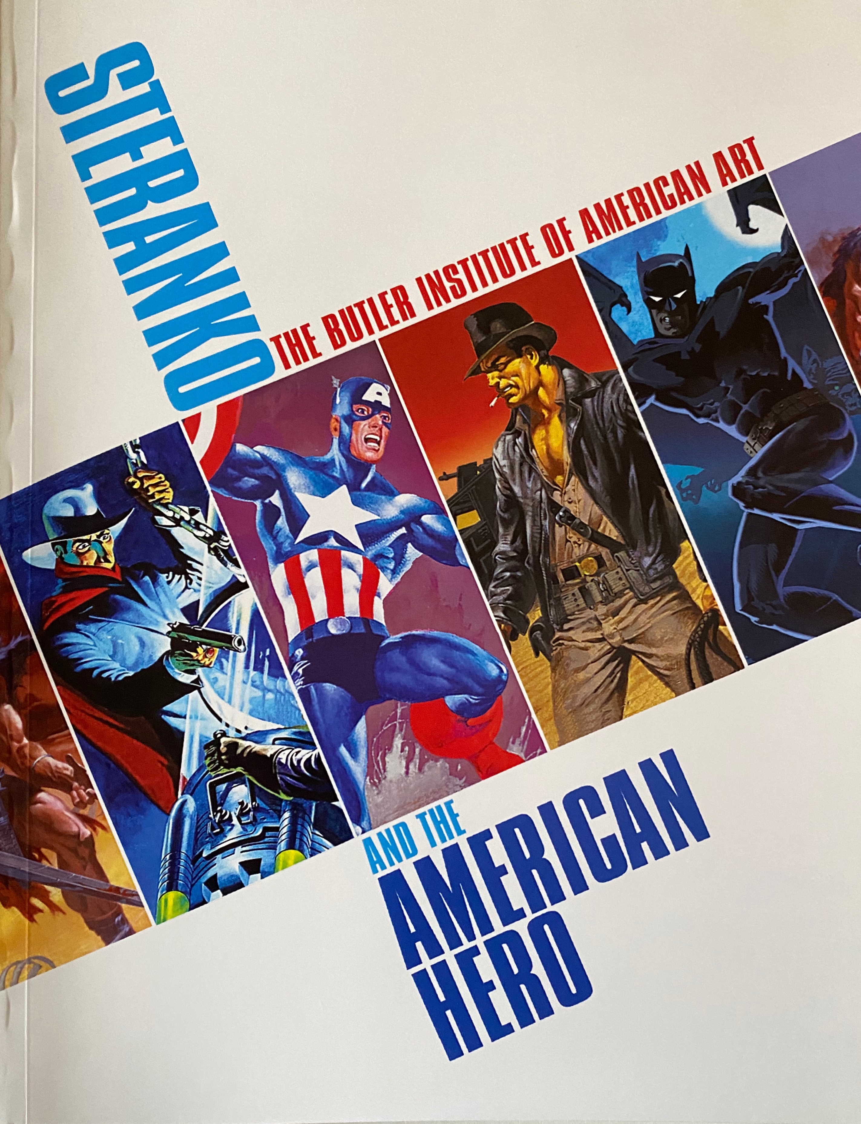
© Black Dog Books.

Back in the early carbon-copy days of SuperStuff (and I’m talking 1974 here), we could’ve only dreamed of sitting down and having a conversation with one of our idols. So this past Friday morning I started the day with no idea that by early afternoon I would’ve had a 30-minute conversation with famed  illustrator, comic historian, publisher and advertising/creative designer Jim Steranko, still vigorous, engaged and excited by the potential of the medium.

It happened this way. It had been a year since my last report of the annual Windy City Pulp and Paper Convention (see here for the 2022 report), so I decided to swing over to Yorktown Westin hotel in Lombard on Day One of the 2023 event to see what had changed in the year since the first post-COVID con had taken place. I was pleased to see that it was already vibrant and humming at 11am in the morning.

The Windy City Pulp & Paper con is a fascinating event, anchored around a main dealers room, with pulp-related films, auctions and panels taking place in smaller ball-rooms around the building. This is no scruffy comic mart set in the back-room of a downstate bowling alley. Attendance was high for a Friday morning, and a cursory look at prices indicated that the lower prices from last year, where many dealers were looking to shift pre-COVID inventory, were a thing of the past.


Upon arriving my welcome back contained a copy of Windy City Pulp Stories #22, an annual book published especially for the con by Black Dog books of Normal, Illinois.  In addition to reprinting some rare pulp stories ,it lead with a very interesting historical essay by Will Murray on the uncredited authors of G-8, plus also some fascinating excepts from the writers' trade journals of 1933, providing great insights in market conditions at that time. The idea of this book, providing content and context to stimulate further interest in the hobby seems a very sound one to me, and could be transferred to the comic-con world as well.


Being a pulp convention, the pickings for comics enthusiasts was generally limited to pulp-related comics, but also included many interesting novelties such as the colour Sunday Funnies sections from 1940s newspapers.


A box of Superman and Tarzan Sunday Funnies from the 1940s

My own route into the pulp world had been via the Doc Savage, Shadow and Avenger paperback reprints in the early 1970s, and then by the subsequent DC and Marvel comic adaptations of those characters. My knowledge of pulp history was subsequently informed by the research and writings of Will Murray and Ron Goulart. So I’m pretty much a pulp novice who doesn’t know too much about G-8 and His Battle Aces, or The Spider, or any of the more obscure characters that surfaced in the 1930s, parallel to the growth of the nascent Science Fiction pulp world. But if I had a barrel of cash this con would be the place to fill in the gaps in my knowledge - table after table of classic pulps - both adventure and SF - and 1950s/1960s paperbacks with their saucy, enticing covers by the artists who had made their bones in the pulp world. 


My first stop was at Chuck Welch’s table. Chuck is the editor of the pre-eminent Doc Savage fanzine “The Bronze Gazette”, which had carried a version of my blog entry on the links between Serpico and Doc Savage from a while back. It was a pleasure to meet him. I encourage anyone with an interest in Doc Savage to take a look at the website  . 


Following my first turn around the dealers table, I headed over to Will Murray’s table, shared with Anthony Tollin, to pick up a copy of Mr Murray’s expanded, revised and retitled edition of his 1980 work “The Duende History of the Shadow”, now christened “Dark Avenger - The Strange Saga of the Shadow”.  I can’t wait to find the time to read the book. Mr Murray also shared that he will be publishing a further volume, collecting a multitude of Shadow articles written over the years, which I will no doubt seek out.


© 2022. Will Murray

Finally I came to a table which was devoted to rare pulp items for sale. What had caught my eye was a copy of #1 of the UK Batman mini-pulps published under the World Adventure Library banner by World Distributors in 1967 - priced at $300! I had paid a pre-decimal one shilling for it in 1967, as recounted in this 2021 blog entry  .


Raising my eyes from the table, I encountered the outstretched hand of Jim Steranko himself on the opposite side, safari-suited and coiffed hair, introducing himself with the question “Can you think of any other comic book artist who has also held a fine art exhibition in one of the most prestigious galleries in the US?”.   I hazarded a guess that perhaps Frank Robbins had exhibited his paintings once he had retired to Mexico, but I don’t think that was the answer that Mr Steranko was looking for. 


Artwork © Steranko

Referring to his artbook “Steranko and The American Hero”, published as a companion piece to his exhibition by the Butler Institute of American Art, we then had a pretty wide-ranging conversation about his approach to art. He opined that artists were either intuitive or analytical. He put Kirby in the intuitive category - someone who drew from his imagination without initial regard to composition - whereas Steranko saw himself on the analytical side, thinking through the placement of elements in a  picture, very much influenced by his advertising discipline.  One example of Kirby’s approach was a sketch of Captain America where Kirby started by drawing Cap’s belt buckle, and then expanding the image out from the centre.


We discussed Steranko’s work on Chandler, as well as his cover design for the Philip Marlowe graphic novel collection.


We also discussed his Shadow paperback covers commissioned for Jove/Pyramid back in the 1970s, and the degree of freedom that he had on overall design. There were no unpublished covers in that series - he always worked on commission. All fascinating stuff.


Mr Steranko  is still working today, most currently on conceptual art for Francis Ford Coppola’s upcoming film Megalopolis (currently in production), continuing a strand of conceptual artwork creation which encompassed Raiders of the Lost Ark, Blade Runner and Coppola’s Dracula.


My final question was about his famous work “Steranko’s History of Comics’, which was published as two volumes of an anticipated six-volume series. Steranko told me that in fact  he had envisioned a four-volume set. He said that he had completed much of the content for Volume 3, but whether it would ever be published was an open question.


I would have liked a photo of Mr Steranko, but he declined as it had been a policy of “no photos” that he’d had to adopt. I made do with his personalized signature in my copy of Steranko and The American Hero”. It was a great pleasure to meet the gentleman ; he is truly a force of nature and remains an outstanding talent. 


And now one of the last men standing from the Bronze Age.


Text © Ian Baker.


All images used are copyright their respective owners and are included here under the context of  Fair Use for the purposes of illustration