Sunday, January 26, 2025

More than a simple UK Price Variant?

© Marvel 1973. Photo by Jon Browne
Having been interested in the history of UK price variant editions of both DC and Marvel for many years, I was surprised to see a post by Jon Browne in the London Loves Comics Facebook group which highlighted a page in the UK-price variant of Daredevil #101, July 1973 which had a full-page ad for Mighty World of Marvel and Spider-Man Comics Weekly. 

© Marvel.  The only ad for UK editions in a UK Price Variant
Was this the only time that more than the price, indicia and minor cover changes had been made to the print-run of a US Marvel comic? I searched out my US copy of Daredevil #101 and the same page contained an ad for the Marvel B&W magazine Haunt of Horror. See below.

© Marvel. Same ad page from US edition of DD #101.
Question: are there any other US Marvel comics with entire pages replaced with an ad for the UK weeklies?   

I wonder why it was done. Obviously the Haunt of Horror was not on sale in the UK, but that never made Marvel replace other ads for ND (Non-Distributed) issues.  Perhaps the 1970 prosecution under the terms of the UK 1955 Children and Young Persons (Harmful Publications) Act made Marvel err on the safe side.

According to Wikipedia, the Children and Young Persons (Harmful Publications) Act 1955 banned the printing or sale of any publication which "consists wholly or mainly of stories told in pictures" that portrayed "(a) the commission of crimes; or (b) acts of violence or cruelty; or (c) incidents of a repulsive or horrible nature; in such a way that the work as a whole would tend to corrupt a child or young person into whose hands it might fall". 

Friday, October 4, 2024

Detective #27 facsimile


© DC Comics

If someone had told me back in 1974 that there would one day be a global "Batman Day", it would have blown my mind. And if someone had told me that one day I'd own a facsimile of Detective #27 almost indistinguishable from the original, my mind would have been similarly blown.

Well, last week, both of those predictions came true, when a new facsimile of Detective #27 turned up in my pull list at my local comic shop, to celebrate "Batman Day". And what a facsimile it is. 

The comic in question is printed at original Golden Age size - not like the thick, yet modern-comic sized, recent DC facsimiles, and not as large as the DC Famous First Editions of yore. This comic is original size, with a matt-finish cover (not glossy), with interior pages being a very good substitute for flimsy newsprint, with accurate colours. It knocks all other facsimile reprints into a cocked hat.

The photos of the interior below render the interior page colours a little too brightly, and the pages actually have a slight brownish tinge to them to approximate the age of a well-preserved comic.

Well done DC!

© DC

© DC

© DC

© DC.   Comparison of size of new facsimile to recent Golden Age reprint


Saturday, September 21, 2024

Re-evaluating Manhunter from 1973 and 1974

A recent post by Scott Dutton over at the Catspaw Dynamics blog about Manhunter, the Archie Goodwin and Walt Simonson hero created in the back pages of the 100-page issues of Detective Comics from mid 1973 to mid-1974, sent me searching out the DC reprint collection from 1984, when all seven episodes of the story were collected in one Baxter-paper book, complete with insightful 2-page editorial by Archie Goodwin himself, eleven years after the publication of the original run. (That was a long sentence).

The original run swept the board for original story and artwork at the 1974 Academy of Comic Book Arts ceremony. During this period Archie Goodwin was pulling double duty both editing the entire book as well as writing the Batman story each issue, and had already decided to leave DC for Creepy at the end of the run. 

I managed to snap up the 1984 reprint book last week off eBay for a mere 99 cents plus postage, and the seller slipped in issue #1 of the subsequent 1986 run of Manhunter by John Ostrander, Kim Yale, Dog Rice and Sam Kieth as well. What a bargain! 


Unlike many earlier Baxter-paper reprints of superhero runs, the colours in the reprint are muted and sympathetic to the original comic, thanks to the work of colourist Klaus Janson. A quick comparison to the original colour scheme does show that it has been completely recoloured, but using the same palate for (IMHO) better choices.


I had the complete run of the story in Detective comics #437 to #443 at the time, which culminated with a Manhunter/Batman team up, FIFTY YEARS AGO, entitled “Gotterdammerung!” .


I must confess that back in 1973, if a comic was illustrated by neither Adams nor Aparo, I was predisposed to dismiss the art as hack work. I didn’t like Simonson’s art at the time on principle. What a difference 50 years make! His artwork is an innovative as Adams - his use of perspective, his use of successive panels with small differences to slow down the action, and the sheer number of panels he can fit on a page and still provide the detail and pacing needed to keep the story totally understandable are phenomenal.


Re-reading the 1984 reprint edition this week I am so impressed by the artwork, the writing, the dynamism and momentum of the story. This would make a fantastic TV series.


Here’s a few pages to whet your appetite. I haven’t read the first issue of the follow-up yet, so cannot comment on it. I will follow up in a subsequent post.


In the meantime, I encourage you to search out a copy of the 1984 reprint and enjoy. Also head over to Scott Dutton’s page for an in depth look at Manhunter’s history along with some recolouring and restoration work on some of Simonson’s original Manhunter art.


© Ian Baker


© DC Comics. Story intro sets the scene

© DC Comics. Example of use of similar successive panels to focus on action

© DC comics. Love the panel bottom right, expanding in the size as the eye follows the characters down underground

© DC comics. Two examples of successive panels. Top line shows character moving forward. Bottom line showing Batman's reaction as villain expires


Friday, August 9, 2024

Way Out West with MARVEL WEST !


© 2023 Mark Ammerman

I have never had any particular interest in Marvel's Western Comics from the 1950s and early 1960s....until now. I was vaguely aware of the names Kid Colt and The Rawhide Kid, and old tattered copies of those comics would infrequently turn up in second-hand shops in Portsmouth back in the mid-70s, but I quickly passed them by in my eagerness to find a Batman comic that might fill a gap in my collection.

Somehow Marvel's Western Comics were any unexplored branch-line of comics history for me, and I had no desire to mosey on down the path of exploration.

I suppose that my interest in things Western was whetted a few years back by Will Murray's excellent history of Western pulps, "Wordslingers", and then a recent rewatch of an episode of Marvel's Agent Carter featured Howard Stark making a movie about Kid Colt further awakened my interest.

Which brings me to discuss a fantastic new, old-school, paper-in-your-hands, no-digital-version fanzine called MARVEL WEST #1, which celebrates the Marvel Westerns of days of yore, with great articles focusing on the generally uncelebrated contributions of artist Jack Keller, who had as great an influence as Jack Kirby on Western comics in the late 1950s, as well as a leading article by Will Murray on the history of Kid Colt.

The book is the brainchild and labour-of-love of Mark Ammerman, who tells us that MARVEL WEST is published under the collective banner of ENCORE, which will be a multi-zine celebration of the 50-year anniversary of COMIC COURIER, a comic fanzine that Mark produced between 1969 and 1972. 

Mark has produced a really professional-looking fanzine - I love the layout - and I look forward to reading issue #2.

Issue #1 can be obtained by jumping to the Comic Courier ENCORE site at http://ccencore.jimdosite.com. In the U.S. or Canada, a single issue is $10. If you live in the UK, a single issue is $20 (because the cost to mail from here to there is nearly $10.) If you live in Australia, you'll have to ask Mark how much postage is required for the 48 pages of MARVEL WEST goodness (you can contact him at .)

Here's a couple of scans to get you interested.


Seeing small images of comic covers always made me want that comic!

Great article by Will Murray

Wouldn't you know, this page from Rawhide Kid #28 came up in my Facebook feed today. (I'm not paranoid, but I know they're watching me). Not a Jack Keller page, but a great Kirby/Ayers page illustrating Kirby's immaculate staging, and featuring a character called Jasker Jelko .........not unlike Funky Flashman....

Until next time, pardners!

© Marvel. Rawhide Kid #28


Wednesday, July 31, 2024

It's here!! Announcing the publication of the final issue of Alan Austin's Fantasy Unlimited!


Alan Austin (1955-2017) was one of the most respected figures in UK comic book fandom. He published a major fanzine about American comic books throughout the 1970s and into the 1980s, at first named Fantasy Unlimited (later named Comics Unlimited), and also the Golden Age Fanzine, Whiz Kids (devoted to the original Captain Marvel and other Fawcett heroes), the first Comic Book Price Guide for Great Britain. and the DC and Marvel Comics Indexes.

His fanzines gave a showcase to a number of future professionals in the comic book business, including, amongst others, Stephen Baskerville and Kevin O’Neill.

Now his Fantasy Unlimited fanzine has been revived for a final issue, re-titled Alan Austin’s Fantasy Unlimited, to include a celebration of his immense contribution to UK fandom in the 1970s and early 1980s.

“It was Will Morgan’s excellent idea to have this one-off issue, and try to involve as many of the original contributors as possible,” says Nigel Brown, who published Alan’s posthumous books. “I was doubtful it was a practical project after fifty years gone by, but I’ve been delighted at the response from names that will be familiar to regular readers of the fanzine, including Will himself (who contributed to FU/CU under his birth name of Howard Stangroom), Martin Lock, Allan J. Palmer 'the Phantom Rambler', Stephen Baskerville, Patrick Marcel, Jean-Daniel Brèque and many others."

“This has been an opportunity for previous contributors to Fantasy/Comics Unlimited to be back in the fanzine one last time, with personal memories and anecdotes about Alan,” Nigel adds. “But Alan Austin’s Fantasy Unlimited #54 will also offer its usual articles, and regular favourites like “We Want Information”, a new “Worlds of Emlock”, and even a special sequel to a comic strip first published in the fanzine forty-nine years ago!”

Alan Austin’s Fantasy Unlimited #54 is a non-profit project, published with the permission of Alan’s literary estate.

It is now available on Amazon in a printed edition only.

Amazon UK link:  Click here

Amazon US link:  Click here

----------------------------------------------------------------------------------

Alan also wrote two books. One was about his life in comics, Comics Unlimited: My life as a Comic Collector and Dealer, the other about his experiences as a book dealer (in fiction form, as a series of short stories), The Adventures of Bernie Burrows, Bookseller. Both of these books are still available on Amazon as paperbacks and ebooks. Follow the link at the top right of the blog to find those on Amazon.


Tuesday, July 30, 2024

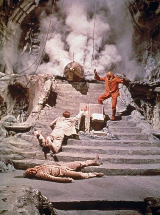
Beneath The Planet of the Apes - Marvel vs Gold Key


Facebook handily reminded me earlier this month that we should be celebrating the 54th anniversary of when Beneath the Planet of the Apes hit US cinemas in 1970. I had to wait until 1975 to see Beneath at the cinema in the UK.  It had been classifed as “AA” upon it’s original release and so I was unable to see the film as I was under fourteen years of age. Our local cinemas in the Portsmouth area subsequently showed double-bills of “Planet of the Apes” and “Escape…”, and “Conquest..” paired with “Battle…”, but “Beneath…” did not make the rounds until 1975, when it showed up paired with “Battle…” at a small cinema in Havant, Hampshire.

By this time, “Beneath…” had acquired quite an allure for me.  I had read the Bantam paperback novelisation, and was yet to read the Marvel adaptation in the pages of the UK Marvel Planet of the Apes weekly comic. I had even bought the Super-8 mm cine film 10-minute condensed version of the film in black & White, even though we didn’t have a Super-8 movie projector!


My unwatched Beneath The Planet of the Apes 8mm film on my bedspread in 1977
And so finally getting to see the film was a great event, and I was not disappointed. Looking at the film now, the narrative suffers from not having Taylor as the protagonist throughout (Charlton Heston said he  would only appear if he disappeared at the start of the film, and was killed off at the end), but despite the story structural issues and the reduced budget, it is still a great science fiction film. Also I’m a sucker for anything with disused railway stations as well, so the underground Grand Central Station was also a big plus for me.


When I finally got to read the Marvel adaption of the film in the Marvel Black & White magazine, scripted by Doug Moench and drawn by Alfredo Alcala, I was very impressed. The artwork was a definite step up from the Marvel adaptation of the first film, drawn by George Tuska. I was not aware at that time that Gold Key had already issued a one-off adaptation of Beneath back in Sept 1970, with a December 1970 cover date.


I dutifully also collected the colour version of the story as reprinted in Marvel’s Adventures on the Planet of the Apes issues #7-#11, with new colouring by George Roussos. It is interesting to compare the Gold Key and Marvel versions.   Of course, Marvel had 100 pages to play with, while Gold Key had 30, but some direct comparisons can be made.


© APJAC and Gold Key

© APJAC and Marvel

Overall, the Marvel version has more power and better pacing. Alfredo Alcala’s artwork is stunning in places. The Gold key version (by Artists Alberto Giolitti and Sergio Costais) is generally very pedestrian, but not without its merits.  Compare the splash pages of each comic and you’ll see what I mean.


The Gold Key splash

The Marvel splash page


I think the Gold Key version is basically a written story illustrated by pictures, whereas the Marvel version is a visual narrative supported by dialogue.  Which I suppose is the contrast between the Marvel Method and the more traditional form of comic scripting used at DC and other mainstream comic publishers in the 1960s and 1970s.


The Gold Key version illustrates specific scenes taken from film stills, whereas the Marvel version does not emulate the camera angles of the film scenes, opting for a more fluid narrative. 


However, it must be said that the Gold Key version has a far better colourist - more accurate to the film, and more evocative. Compare the sequence early in the story when Taylor & Nova encounter storms and lightening ; the Gold Key version is miles more effective.


© APJAC and Gold Key

© APJAC and Marvel

The Gold Key version adheres more closely to the film in terms of costumes.  Taylor has a loin-cloth in the Gold Key version ; he wears a Tarzan fur in the Marvel version! 

Also, the Apes as drawn in the Gold Key version closely resemble their film counterparts, whereas in the Marvel version, the apes look far more simian.


Scene as shown in Gold Key

Same scene from Marvel

And the pacing on the ending in the Marvel version is far better, building the tension to the final atomic explosion.  The Gold Key shows the bomb going off an an accident ; the Marvel take shows the detonation of the Doomsday Bomb as a deliberate act by Taylor.


The Gold Key versions ends with Taylor triggering the dommsday bomb by accident

The Marvel version ends in a sombre, deliberate manner

Go out and find a copy of each comic and do the comparisons yourself. It's not often in comics that one gets the chance to compare two different versions of the same story.


By the way, I see that the recent Beware the Planet of the Apes comic from Marvel integrates individual panels from the George Tuska adpation as part of a flashback sequence.

Monday, July 22, 2024

Still here!

Just a brief post to let all of our regular readers know that we’re still here.  It is just that various projects and life has gotten in the way.

I’m currently typing this from a hotel room in Sioux Falls, South Dakota, where Mrs B and myself are staying as we travel homewards to Chicagoland following our bi-annual participation in “MINI Takes The States”, a cross-country rally for MINI Coopers of every stripe. This year we rallyed in our MINI Cooper Roadster S. We had around 900 MINIs participating in the official route which started in Albuquerque, New Mexico on July 13th and finished in Seattle, Washington on July 21st 2024. We will have driven close to 6,000 miles including the time to get to the start line and finish lines, over a period of 2-3 weeks. If you’re a fan of driving 400-500 miles every day for two weeks, this is the hobby for you!


Here are a few photos from the event. I loved the Mini Roadster with the Rocketeer logo, particularly.

Love this photo of the Rocketeer MINI Cooper Roadster.

On the road from Albuquerque, New Mexico to Durango, Colorado

Our Roadster in Ouray, Colorado
Of course, taking part in such an event cuts into blogging time on the SuperStuff blog, so apologies for that.


However, things continue apace in the SuperStuff bullpen. My co-editor (and pal of fifty-plus years Nigel Brown) is busy putting the finishing touches to the print edition of Fantasy Unlimited #54, the Alan Austin memorial edition of that wonderful fanzine from the 1970s and early 1980s.  That should hopefully see print later this year.  Once it is ready, we will post an update here so that fans can buy a copy from Amazon, priced “at cost”.


I’ve (baggsey here) been continuing to research the history of the Atlas Publishing and Distributing Company Ltd, known to UK fans of American comics as the company responsible for the SuperAdventure, Superboy, Superman and Batman annuals we in the UK would see in the 1950s and 1960s.  Atlas Publishing and Distributing Company Ltd (no connection to the company which was the precursor of Marvel) was responsible for the publishing of US pulps in the UK from as early as 1915, before moving into comic reprints in the late 1950s, and the more I dig into the personalities and events behind the company, the more intriguing it gets. I’ll probably blog a summary about it here, but it really warrants a book or paper of its own to ensure that all of the research data is captured for posterity.


Of course, the big news here is Joe Biden dropping out of the Presidential race. Whatever your political affiliation, this is a time of great political upheaval in these United States. I grew up in the UK and spent half my life there (I’m hoping to get to age 80 at least :-) ). Recently, I’ve become more aware that my political views have been greatly influenced by the messages of DC and Marvel comics of the 1960s and 1970s; messages that heroes with strength have an obligation to help the weak, for example. Or the message that it is incumbent on us to not discriminate on basis of religion, or colour, or sexual orientation, or any other divisive criteria.  I fervently hope that any of us aging reprobates that revere the comic stories of the sixties and seventies embrace those values. Any thoughts on this, please respond in the comments section below.