Saturday, September 11, 2021

Star Trek TMP Remastered in 4K - High Hopes


 Copyright Marvel and Paramount Pictures

As a long time Star Trek fan, the Bronze Age was a great time to be alive. In that period between the original series / animated series, and the debut of Star Trek The Motion Picture in 1979, the thought of Star Trek on the big screen was a fantastic dream. I would take photos from TV, even use my Dad’s 8mm cine camera, as a way of capturing the magic of the original show. This would have been prior to the appearance of the Philips 1500 video recorder around 1976. My pals Nigel and Geoff were avid members of Ross Carter’s local Star Trek Information Group (STIG), eager for information on what was happening at Paramount.

Like many, we were so disillusioned by Star Trek The Motion Picture when it debuted in London. The film was so slow and unlike the TV series we loved. The story of rushed production is well known. But the journey of the Enterprise within V’Ger has grandeur and massive scale, as does Spock’s attempt to mind meld with the machine (despite the film makers aborting the Memory Wall sequence). 

With the release this week of a brief clip of the Enterprise inside V’Ger I harbour high hopes (no doubt which will be dashed) that the current remastering and re-creation of the Director’s Cut for 4K will build upon that improved cut of the film, and perhaps even improve upon those sequences inside V’Ger.

But for me the litmus test of improvement (slight for many) will be that they digitally correct the colour of the shoulder flashes of Spock and McCoy in the tag scene of the film. The scene starts with Spock wearing a red flash and McCoy with a blue flash, and the scene ends with Spock with the blue flash and McCoy with the red one. Unless there is  sequence inserted which shows them swapping jackets while Kirk emotes his pretty pompous speech, the film will still be ruined for me. ( :-) )

Copyright Paramount Pictures. Note colour of shoulder flashes

Copyright Paramount Pictures. Note colour of shoulder flashes now.

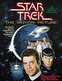
I took a quick look at the recent facsimile edition of the Marvel adaptation of the film, which brings different colours of shoulder flashes into play. No attention to continuity at all! Plus the drawing of Kirk looks more like Chris Pine than Shatner.


The Marvel comic is interesting as it includes a rendition of the original Memory Wall sequence, but I was not impressed by the quality of the artwork in rendering the cast.

Thoughts folks?


The worst Spider-Man poster ever?


As Mrs B and I are taking a short seaside break, SuperStuff postings may be a bit impacted, sitting here on the sun lounger. However, I came across this black and white photo I took back in 1973/74 of a Spider-Man poster that presumably was a free gift from a Marvel weekly or FOOM? At the time I must have thought it was pretty cool, but now I think it must be the worst Spider-Man poster ever produced.

Apologies for the dim image , but I’m sure it may ring a few bells? Any thoughts on where it came from? Anyone still have it on the back of their bedroom door?

***** UPDATE Sept 14th *****

Thanks to Kid for more background on the poster, to be found over at his blog at https://kidr77.blogspot.com/2020/01/poster-puzzle-finally-solved.html 


Saturday, September 4, 2021

How did you list your comics? by Ian Baker

Spiderman © Marvel. Book © Ian E Baker

One of the few artifacts that I have kept from my teenage days are my notebooks listing all of the comics that I collected back in the 1970s. Every time I bought a comic I would assiduously document the purchase, deriving a great sense of satisfaction as I dutifully noted down the title of the lead story in each book. Documenting what I had purchased was all part of the collector instinct. As a twelve year-old I would enjoy just looking at the titles listed in the notebooks, and dreaming of the days when the gaps would be filled. 

Revisiting them now, these collection checklists contain a wealth of information that trigger memories of key comic book acquisitions. It also provides some insight into when my teenage interest in American comics waned.


Four small notebooks cover a period predominantly from my age 12 to 16 , a span of years that seemed to go on forever at the time.


I believe that my purchase of the first notebook co-incided with my Dad building a shelving unit for me to stack my comics in separate piles in an alcove in my bedroom (they had previously been in one wobbly pile at the back of the wardrobe), and the structure and physical organization of my comic collection probably prompted me to create a ledger.


As the first book filled up, I bought a second, and then a third, to document my collection as the number of titles I collected grew, and I started to squeeze each comic into a plastic bag from a roll of bags bought from Long's in Albert Rd, Southsea. (An early attempt at comics preservation which would result in "rolled spine" at best and toxic damage from unstable plastic at worst).


Hulk and Thor © Marvel. Where did those transfers come from?


Things that jump out at me, looking at them today:

  1. The notebooks were from Woolworths and very robust - “Winfield Memorandum 381” - small ledger books with nice binding and stitched pages. (Incidentally - did you know that the brand "Winfield" was the middle name of Frank Winfield Woolworth)
  2. I put Marvel stickers on the covers to add some flair. (Where did these stickers come from ? Mighty World of Marvel? Spider-Man Comics Weekly?)
  3. On book #2 I illuminated some of the interior pages and a back cover with rub-on Transfers/water tattoos of key Marvel characters (Where did the transfers come from?)   
  4. I used the latest Dymo tape technology to add titles the book covers. (Remember the Dymo? I think I still have mine.)
  5. Batman #246 and Detective #428 are missing in checklist book #1 - this reflects a brief period of a dock strike (or a warehouse fire??) when DCs did not get imported into the UK for one month. Luckily I got the missing issues as import copies sometime after April 26 1973.
  6. Amazing Spider-Man stopping at #120! Just before the death of Gwen Stacy! But I list the two issues that my Gran brought back from the US for me 6 months later.
  7. I added tabs to the pages for ease of access (I believe these tabs were from my Dad’s work, I think).
  8. A few pages of my Dad’s handwriting listing MWOM 1-19, and SMCW 1-59 for me, around Mar 30th 1974. Both of my parents were very tolerant, even supportive, of my comics collecting. They probably thought it kept me out of teenage mischief, plus they liked my two comic collecting friends Nigel Brown and Geoff Cousins very much.

Spider-Man © Marvel. Example of my Dad writing up some titles for me 37 years ago.


Checklist book #1 was probably started sometime after a holiday visit to Ventnor on the Isle of Wight in April 1972 during which I picked up twenty or thirty back issues of Batman and Detective at Mr Keen’s antiquarian bookshop in Ventnor’s Pier Street. That goldmine of comics at 2p each really kick-started my comic collection.


Reading checklist #1, at that time my collection was limited to the following titles, and pretty Batman-centric:

  • Batman  (it all started with  Neal Adam’s Batman #234 “Half an Evil”)
  • Brave & Bold (because Jim Aparo’s art was next best to Adams’)
  • Daredevil (because he was Marvel’s “Batman”)
  • Detective (‘cos Batman was in it)
  • Justice League of America (‘cos of Batman, despite Dick Dillin art)
  • Marvel Super Heroes (I liked the early 60s reprints)
  • Marvel Tales (early 60s reprints)
  • Phantom Stranger (because I was so impressed by Jim Aparo’s art from Brave & Bold #98 and the great Neal Adams cover of PS #17)
  • Amazing Spider-Man (apart from Daredevil the only other Marvel hero I liked)
  • Teen Titans (‘cos of Robin)
  • Wanted (DC reprints)
  • World’s Finest (‘cos of Batman)

I then added Marvel's Iron Man soon afterwards , and by the end of August 1972 I had expanded my collection still farther to include: 

  • Amazing Adventures (because of Adams artwork on the first War of the Worlds)
  • Avengers (the Adams-drawn Skull-Kree war storyline)
  • Green Lantern-Green Arrow (because of Adams and I liked the new Green Arrow)
  • X-Men (Adams' run)

At this point I was pretty disciplined and focused in my collecting.  This was more a byproduct of limited pocket money rather than any other reason, I suspect.


I pretty soon started running out of space to list new comics in book #1 in February 1973, so it was a trip back to Woolworth's for a second book. 


As I started checklist book #2 on April 26 1973, the impact of being able to buy mail-order back issues from Alan Austin’s Fantasy Unlimited had enabled me to start collecting old DC Batman annuals and Batman 80-page giants, and old X-Men issues. My weekly Saturday afternoon comic hunts with Nigel Brown surfaced new titles Secret Origins and Swamp Thing.


The impact of the success of the UK Marvel weeklies was now being felt, with spotty distribution of many US Marvel titles, and outright bans of importation of some titles (Spider-Man, Avengers, Iron Man all suffered this fate to some degree, and my collecting of those titles came to an abrupt stop).


With the reduction in Marvel titles in the newsagents, my collection expanded to encompass more DC titles, plus Marvel’s Conan (which despite some distribution gaps was still around). And by the end of February 1975, I had developed robust runs of 

  • Conan
  • House of Mystery
  • The Shadow (DC and Archie)
  • The Demon 
  • The Creeper (back issues)

As I started checklist book #3 in March 1975, I had expanded the collection yet again to include:

  • Adventure Comics (loved the Spectre stories drawn by Jim Aparo)
  • Black Magic (Jack Kirby reprints)
  • Batman family
  • The Brute (Atlas)
  • Captain America (Jack Kirby’s return)
  • Destructor (Atlas)
  • House of Secrets
  • Joker 
  • OMAC
  • Our Fighting Forces (Great Kirby comic)
  • Planet of Vampires(Atlas)
  • Secret Society of Super Villains

By the time I started my 4th and final checklist book in February 1976, I was simply noting the issue numbers, and not bothering to record the titles. I think this was symptomatic of a waning enthusiasm for comics now that Neal Adams had left the scene, which co-incided with my increased interest in the opposite sex and 1940s pulp heroes!


Edition #4 of the checklist simply lists wanted issues of :

  • First Issue Special
  • Mister Miracle (back issues)
  • Secrets of Haunted House
  • Doc Savage (Marvel colour and B&W)
  • Invaders
  • Marvel Double Feature
  • Tales of Suspense
  • Deadly Hands of Kung Fu
  • DC Showcase


I know of a few other titles that I collected but never documented:

  • Unknown Worlds of Science Fiction, 
  • Dracula Lives! 
  • Plop! 

And that was it. I kept collecting sporadically until I sold everything in the early 1980s, before a resurgent interest around 1987 with the arrival of Alan Moore and Frank Miller to revitalize the comic scene.


Looking back, my comic heroes of those years largely were bereft of super powers, and used a mix of science, detective and athletic capabilities to right wrongs. I was drawn to light horror anthologies and increasingly stories based on pulp heroes from a previous generation. And I would buy any series that featured art by Neal Adams.


I’ve always had a bit of a passion for building checklists and ordering data. Later on, in 1979, when my interest in collecting had moved on to pulps, I spent a year of my university degree working at IBM. My enthusiasm for getting into computer programming was driven by a desire to list all of my Doc Savage pulps on a computer and then be able print out the lists in various sequences.


So I have comics to thank for my career in computers and ultimately my desire to live in America where non-distributed titles were an unknown phenomena!


======================


If anyone can confirm where the Spider-Man sticker, or the Thor and Hulk transfers came from, please chip-in in the comments below.


[Thanks to Duncan McAlpine’s https://www.comicpriceguide.co.uk for confirming my memories of  non-distributed issues of Marvel's in the early to mid 1970s]


Thursday, August 26, 2021

Batman Trading Card Stories #2 : To The Batcave!

© DC Comics and Topps - 1966


One of the first Batman trading cards I ever owned was this one - “Black Bat” set # 38 - of the Dynamic Duo posing outside the entrance to the Batcave from within Wayne Manor. This is interesting because:


  1. The Batcave entrance had been replaced by an elevator in the comics two years earlier in 1964 
  2. Access to the Batcave was by a sliding bookcase to the famed Batpoles in the current TV series
  3. The Batman trading card shows a laboratory room beyond - not stairs, nor a cave nor steps to a cave
  4. It asks the question "Why are they in costume within Wayne Manor?"


As previously mentioned on this blog, Norman Saunders usually (but not always) painted the trading cards based on pencil drawings supplied by Bob Powell. Saunders then included additional details not present in Powell’s pencils, so the paintings were always likely to have some deviation from comics canon.


I thought I’d take a deep dive into the history of the grandfather clock as the entrance to the Batcave, and see if I could locate any earlier material that might have inspired the specific elements of the painting by Norman Saunders.


The text on the back of the card by Larry Ivie gave no clue, so I decided to go back to the beginning, to the first time that the Batcave’s origin was documented in the Batman "dailies" on October 29, 1943, in a strip entitled "The Bat Cave!”.


© DC Comics , Oct 1943


As you can see, the entrance to the cave in this strip was by a sliding bookcase. 


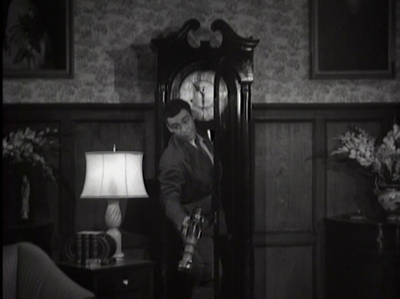
However, that same year 1943, the first Batman & Robin movie serial was released, which featured a large grandfather clock as the entrance to the cave from within Wayne Manor. Bob Kane was so taken by the idea that he passed it on to writer Bill Finger for subsequent incorporation into the comic. [Interestingly, the conceit of a large grandfather clock covering the entrance of a secret room was lifted from the 1920s silent film “The Mark of Zorro”.]


Note that in the 1943 serial, the clock is about 8’ tall, and the dynamic duo squeeze through the front of the clock, past the pendulum to gain access. The clock appears to be in the library.


© Columbia Pictures and DC Comics. Bruce Wayne (Lewis Wilson) squeezes through the clock into the library.


The serial also features a sequence when Batman and Robin enter the manor in costume, and the pass through the clock to the Batcave beyond.


And furthermore, the serial featured a crime lab for the first time.


© Columbia Pictures and DC comics. The "Bat's Cave" crime lab


It was five years later that the clock was  incorporated into DC canon in 1948’s Batman #48 “1,000 Secrets of the Batcave”. (Editor Jack Schiff, Artist Sheldon Moldoff, Writer Bill Finger) when burglar Wolf Brando enters Wayne Manor and accidentally stumbles against the clock, triggering a switch that opens the clock and reveals the Batcave beyond. 


© DC comics. Batman #48

The clock was then to be featured in 25 stories across the next 19 years across the three comics Batman, Detective and World’s Finest, even past the time when until Julie Schwartz took over Batman and Detective Comics editorship in 1964 and replaced the stairs with an elevator.


What emerges within those comic stories are two distinct versions of the clock:


  • 1. A clock around 6’ in height which  swings open (usually hinged on the left hand side to the wall) to reveal a flight of descending stairs in the subsequent panel

© DC Comics. Batman #99. "Phantom of the Batcave". Artist Sheldon Moldoff
  • 2. A much larger clock - presumably 8’ in height and wider - which enables our heroes to open the glass front and pass through (generally run through) the clock onto the stairs beyond.

© DC Comics. Batman #110. "The Phantom Batman". Artist Dick Sprang


Regardless of the design of the clock, all comics and the 1943 movie serial showed an immediate drop to the stairs beyond.


But the subsequent 1949 Batman & Robin movie serial starring Robert Lowrey had no stairs beyond the large grandfather lock.


© Columbia Pictures. Bruce Wayne (Robert Lowery) rushes through the clock to the room beyond in the 1949 movie serial


Throughout these comic stories, our heroes never go through the clock in costume, with one partial exception, which I cover below.


Bill Finger was to write the majority (13) of the Batman stories featuring the grandfather clock (closely followed by Edmond Hamilton with a tally of 9 tales) ,  but the decisions on how the clock was portrayed fell to the artists themselves.


If the stories were drawn by Sheldon Moldoff , the clock was depicted as about 6’ tall and swung out to reveal the entrance to the Batcave ; if drawn by Dick Sprang (the “good” Bob Kane ghost), the clock was much larger with a door on the front that our heroes passed through. 


© DC Comics . My personal favourite of the stories is Dick Sprang’s “Batman Baby Sitter” from Batman #93, 1955.


Looking at the list of stories, the appearance of the clock seemed to almost alternate between issues. In Batman #110, in the same issue, Sprang and Moldoff draw the clock completely differently in subsequent stories. Editor Jack Schiff did not seem to care about lack of continuity, despite editing all three comics featuring Batman during the entire period.


List of all stories with the grandfather clock


Although Jack Schiff was editor of World’s Finest during this entire period, it was not until World’s Finest #109 in 1960 that the clock appeared in a story drawn by an artist other than Sheldon Moldoff or Dick Sprang. (Neither Jerry Robinson nor Lew Sayre Schwartz ever drew the clock, for example). World’s Finest #109 was drawn by Curt Swan and written by Jerry Coleman. In this story (Street date 3/3/60), “The Bewitched Batman” , Robin and Superman in costume walk through the larger clock  onto the stairs beyond, and being the only instance of costumed heroes using the entrance.


© DC Comics . World's Finest #109. "The Bewitched Batman". Artist : Curt Swan


I’m inclined to believe that Curt Swan was influenced by Dick Sprang’s larger clock approach than with Sheldon Moldoff’s movable clock. [Sprang was a friend of Curt Swan , referring to him by first name only in an AlterEgo #107 interview]


Swan was to draw the clock twice more, in 1964 and 1965 (this time in stories written by Edmond Hamlilton) and in each appearance drew the clock as an 8’ tall clock, but variously had the clock swing or slide aside to reveal the stairs to the cave. 


The final rendition of the clock was by Al Plastino (World’s Finest #165 - street Jan 26th 1967) showing a smaller 6’ clock being simply moved to the right.


© DC Comics. World's Finest #165. The last appearance of the grandfather clock in the Silver Age.


By this time, Mort Weisinger had taken on editorship of World’s Finest, and seemed completely unaware that Julie Schwartz had replaced the grandfather clock with an elevator three years earlier back in 1964!


[Unlike Marvel of this period, editorships of DC comics were run like personal fiefdoms, which explains the lack of continuity between Batman/Detective, World’s Finest and Brave & Bold during the 1960s.]


So back to the Batman trading card origins: if there was any influences at all on Norman Saunders, it was the 1943 movie serial and the comics imagery of Dick Sprang. The 1943 movie serial was the only example of Batman and Robin in costume outside the clock in Wayne Manor. This scene was most likely the source of the idea for the trading card, but Saunders or Powell may have been influenced by Curt Swan’s rendition of Robin and Superman passing through the clock.


The 1949 movie serial however provided the concept that the clock led directly to the crime lab on the same level.


More recently, there has been much retconning of the grandfather clock’s importance in the Batman mythos, with the hands of the clock being set variously to 10:47pm or 10:48pm as the  time of Bruce’s parents' death. ( Batman vol. 3, #69 (March 2019))
Thursday, August 19, 2021

Newsagents of the Past - By Ian Baker


© Martin Hulbert

Is there anything guaranteed to make the pulse quicken faster than the sight of an old newsagents, with the prospect of a spinner rack inside containing new American comics? 


When I grew up,  all newsagents looked like this photo from 1974, taken by Martin Hulbert and posted on the Memories of Bygone Portsmouth Facebook group. The shop in question was in St James Street, Portsmouth (close to the Dockyard), and is one of 100+ newsagents in Portsmouth in that period. Strangely, I cannot remember ever visiting the newsagents in the photo,  an area redeveloped shortly after this photo was taken.


Where have the newsagents gone? When did they stop looking like the shop in the photo? 


For a bit of time travel, take a look at this video from December 16th 1969, courtesy of BBC Archive. It's a clip from Tomorrow's World featuring James Burke. Freeze the video around the 40-second mark and look at the new comics in the rack on the wall.  Takes you back, eh? I can make out both an ATOM and Captain Marvel.


James Burke - Tomorrow's World © BBC Archive


© BBC Archive - see Comics on the Wall


Here's the link to the video https://twitter.com/BBCArchive/status/1074333330269704193

Friday, August 6, 2021

Batman ‘66 trading card oddities #1 - "Out On A Limb"

© Topps and possibly Estate of Norman Saunders. Who knows?

A while back on this blog I argued that Norman Saunders brought a pulp cover sensibility to Batman within the paintings he made for the first 3 sets of Batman trading cards issued by Topps in 1966. 


One of the less lurid, but memorable, cards for me was from the second series of cards - Red Bat #13A “Out On A Limb”. 


[This is memorable because I first set my eyes on the original painting over 40 years ago, during a fly-drive holiday that my pal Geoff Cousins and I did in California in the summer of 1979. The small Bristol-board image was on display under glass at American Comic Book Company, 106 N Harbor Blvd, Fullerton, CA  which was one of many stores which specialized in Comics-related magazines, pulps, adventure novels, gum cards in the Los Angeles area at that time. (A shop long since gone). It was around 11am on the morning of July 10th 1979.]


American Comic Book Company site in 2021


With regard to the production of the Batman cards, the arrangement was for Bob Powell to provide the pencil  layouts that Norm Saunders would subsequently use as the basis for the finished paintings. This was similar to the previous freelance arrangement that Powell had with Topps in regard to the creation of 1961’s Civil War News trading card set and 1962’s Mars Attacks set. The difference with the Mars Attacks set was that Powell did the final pencil art based on early pencil roughs (“concept roughs”) developed by Wally Wood; Norman Saunders then did the final painted art. 


However, in the case of the painting of “Out on A Limb”, the image is a rendition based on the cover of the cover of DC comic Batman #57  (Feb/March 1950, on sale Dec 9th 1949),  originally drawn by Win Mortimer. (J. Winslow Mortimer).   


© DC comics

So how did the selection of this cover come about? 


Bob Powell had never worked for DC. During the early 1960s Powell did draw a handful of stories for Marvel Comics featuring the superheroes Daredevil, Giant-Man, the Hulk and the Human Torch, his last comics pencilling work being for Marvel on Daredevil #11 cover dated Dec 1965. 


Win Mortimer, conversely, had only ever worked for DC up until this time, and there is no evidence that Mortimer or Powell knew each other, or that Win Mortimer had any involvement in the development of the Topps cards.


A clue to the answer may lie within the text on the back of the card itself, written by the mystery third collaborator with Powell and Saunders. The text reads: 


“Vicky Vale will go anywhere to get a story. When the lovely lady of the press found out too much about the Comino Gang, Vicky was thrown off a cliff. She managed to grab a limb and hold onto it until Batman came to her aid with the Batcopter.”


This text is Interesting because:

(1) Vicki Vale does not feature in the Batman TV series at all, so mentioning her seems “off-message”

(2) Vicki Vale first appeared in Batman #81, on sale a full four years after the comic cover being copied was published. The woman on the cover is not Vicki Vale.

(3) The comic book on which the painting is based contains no story linked to the cover image.

(4) The Comino Gang mentioned in the text has never featured in any Batman story, with or without Vicki Vale.  Nor has the “Camino” gang, as an alternative spelling.

(5) Batman is using the Batplane, not the Batcopter, to rescue Vicki (Let’s forget the likelihood of Batman and Vicki being smashed into the side of the hillside at 500 mph).

(6) "Vicki" is misspelled as "Vicky"


So who was the mystery writer? According to Alter Ego #152, Larry Ivie wrote the text for the Batman cards illustrated by Norm Saunders.


© Alter Ego #152


I understand that Larry Ivie was well known in the late 1950s/early 1960s comics community primarily as a comics fan, but in fact he latterly became a comics pro, writer and illustrator, although his mark on the industry consciousness has been faint. According to Roy Thomas, Ivie was famed in fandom for his big comic collection since the 1940s, and subsequently worked for Marvel, Charlton, Archie, DC , EC, Dell and Warren plus others over the years.


According to www.bailsproject.com, Ivie ghost-wrote some Batman stories at DC around 1965, and as per writer Sandy Plunkett in Alter Ego 152,  Ivie also wrote the scripts for “mini-comics” featuring Batman that were included as premiums inside boxes of Pop Tarts in the US in 1966.


© DC comics - a panel from one of the Pop-Tart comic inserts written by Larry Ivie


Ivie was engaged on these Batman comic projects at the same time that he was doing freelance work for Wally Wood at his studio. My guess is that based on Ivie’s concurrent Batman work and the common knowledge of Ivie as having a large DC comic collection, is that Wally Wood recommended Ivie to Topps to write the text on the trading cards.


Powell was suffering from health issues at this time, and Ivie may well have chosen the cover of Batman 57, not Powell. The reference to Vicki Vale and the Comino Gang may well have been that no-one was checking the card narrative against the TV series “bible”, and Ivie relied on his knowledge of past Batman comics to develop the text.


Ivie’s mention of “Batcopter” is interesting. Perhaps Ivie’s idea was to substitute the Batcopter for the plane but Saunders’ direction to use the Batman #57 cover as a template missed-out that suggestion. 


Of course, this is all conjecture. I’m not aware of any detailed history of the development of the Batman cards (can anyone point me to one?), but I’m sure there are stories behind many of the cards. Certainly some of the “Black Bat“ set seem to have been painted by someone other than Norm Saunders, for example.

Wednesday, August 4, 2021

The Criminal as Anti-Hero in Comics by Ian Baker

3 faces of Parker: Lee Marvin as "Walker", "Savage" and "Stark" © Warner Bros, Fantagraphics, DC


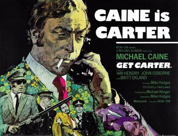
I was watching Get Carter earlier this week - a film I had not watched for 25 years or so - and pondered that although the film (and the book on which it was based) were created in the time of the Bronze Age, that the concept of criminal as hero (existing in the genre "neo-noir") was not something that had figured in the comics I was reading at that time.


For those of you unfamiliar with the novel Get Carter (aka Jack’s Return Home) by Ted Lewis,  or the satisfyingly faithful film adaptation directed by Mike Hodges (starring Michael Caine) the story revolves around a London gang enforcer returning to his hometown to discover who killed his brother, and exact retribution. 


It’s a compelling story and has been hailed as a seminal “Brit-noir” classic, although if truth be told, the film shares elements with  the 1961 film Blast of Silence (which starts with a train emerging from a tunnel into daylight) and ends on a very similar note as the credits roll. 


Get Carter also shares many similarities in premise and execution with both the book and films of Richard Stark’s (pseudonym of Donald Westlake) The Hunter, in which the anti-hero Parker is on a personal mission to hunt down the fellow gangsters who betrayed him.


3 versions of The Hunter: Paperback © University of Chicago Press, Hardback with plates by Darwyn Cooke © PenguinRandomHouse, Comic Adaptation © IDW Publishing


My first exposure to this type of storytelling was around June 1st 1974  (the weekend incidentally following my first comic-con attendance in Emsworth) when my pal Geoff Cousins and I went to the Essoldo cinema in Albert Rd, Southsea to see The Outfit, a film adapted from an early Parker novel by Richard Stark. I remember being slightly confused that I was being asked to root for the bad guy.


The popularity of these types of films has persisted since Kubrick’s The Killing in 1956, through to the current day. Most notable in the 1960s was Point Blank, the first adaptation of Richard Stark’s The Hunter, the Parker debut starring Lee Marvin as Walker (the name substituted for Parker). 


The protagonist of these films is usually a man untroubled by conventional morality, but works and acts within the bounds of his own code of conduct. A professional with survival skills, only in extremis is he driven by emotions of retribution or revenge. Unlike the purer motives of the Private Detective in fiction, he is only driven to right past wrongs where he has a personal stake in the outcome.  Sometimes mistakenly categorized within the P.I. genre, in fact the neo-noir genre is a genre unto itself. The website The Violent World of Parker is a good starting point for a deeper dive into the books and films that inspire or are inspired by this genre, and is highly recommended.


So how has the neo-noir hero fared in comics? 


It is fair to say that the image of the criminal anti-hero has been a creation of the movies which was then transplanted into comics ,and has been nurtured most recently by creators the likes of Ed Brubaker, Frank Miller, Max Allan Collins, Darwyn Cooke and others.


Crime comics were big in the 1940s and 1950s (Crime Does Not Pay, Justice Traps The Guilty, etc), with a clear mandate to show that criminal activity was a bad thing. Nonetheless,  the tough material was squeezed out during the purge of comics in the late 1950s which feared glamorizing the criminal, leaving the likes of the anodyne DC’s Mr District Attorney to pick up the slack.


Mr District Attorney post-Frederic Wertham


In the next decade, Gil Kane independently published His Name Is... Savage #1 (June 1968), which had an image of Lee Marvin as Parker on the front cover, riffing on the Parker persona by making the lead an espionage agent, and jettisoning the criminal element of the character.


Crime stories resurfaced briefly in 1972 in Jack Kirby’s In The Days of the Mob (a look back at organized crime in the 1940s) , and DC introduced Jonah Hex - (All Star Western #10 Feb 1972) - a bounty hunter who worked outside the law - but this was the closest that DC would come to a criminal anti hero until Max Allan Collins wrote about a mob enforcer on The Road to Perdition in 1998 for Paradox Press (a DC imprint).


Over at Marvel, February 1974 saw the introduction of Frank Castle as the Punisher in the Amazing Spider-Man, and so the idea of a man who operates outside the law and adopts extreme tactics in pursuit of the unredeemable entered the MCU.


Pulp revivals of the likes of the Shadow in the late 1980’s started to introduce a more brutal modern interpretation of the anti-hero, but with a clear understanding that our protagonist was on the side of law-and-order.


Sin City from Frank Miller introduced a neo-noir world in April 1991, but no single protagonist who fit the professional thief mould.


It was Darwyn Cooke who finally brought the character of Parker (renamed “Stark”), the professional thief and hard man,  into the original DC graphic novel Selina’s Last Score (2002), to be followed by a brief re-appearance in DC’s Solo (2004), Stark coming off the worse for wear following an altercation with Batman in the story Deja Vu.


Since then, several American and British comic book writers have created interesting work in the crime comics genre, sometimes incorporating noir themes and novelistic storytelling into realistic crime dramas and even into superhero comics. These writers include Brian Azzarello (100 Bullets, Jonny Double), Brian Michael Bendis (Sam and Twitch, Jinx, Powers, Alias), Ed Brubaker (Gotham Central, Criminal), Frank Miller, David Lapham, John Wagner (A History of Violence, Button Man), Chris Condon and Paul Grist, ably interpreteded  by artists of the calibre of Sean Phillips and Jacob Phillips.


Their work has figured predominantly in independent comic magazines, and increasingly in original graphic novels (OGNs). Interestingly, Sean Phillips was commissioned to adapt the opening sequence of 1961's Blast of Silence into a short comic included with Criterion's DVD release of the film in 2008.  Take a look at his blog for more information.


© Criterion and Sean Phillips


The pioneering work of Darwyn Cooke and IDW in 2009 of adapting the Parker novels directly to hardback OGNs has opened the gate for subsequent creators to bring these sorts of stories to a different audience than the average comic-book reader.

Those of you who have seen Get Carter may recall that the opening sequence of the train journey from London to Newcastle is a fascinating montage of the exterior of increasingly nondescript cities and empty farmland intercut with Carter enjoying the luxury of First Class travel on British Rail in 1970. Carter surveys his fellow travelers and notices that one passenger is reading the The Sun newspaper with the headline “Gaming Chiefs warn of Gang Wars” while a schoolboy reads a comic. 


Name that comic - presumably 1970/1971 timeframe

Can anyone identify the comic?